
Jordan Health Service
Jordan Health Service
Jordan Health Service
SaaS Web App
SaaS Web App
SaaS Web App

Overview
Overview
Jordan Health Services (JHS) supports thousands of in-home visits every day, but the software nurses relied on was slowing them down. Internal logs showed that 42% of visit documentation was completed after hours, and support tickets revealed frequent sync failures on rural routes. Tasks that should have taken seconds reviewing care plans, updating vitals, or confirming medications often required switching between 3–4 separate tools or returning to the office to reconnect.
Jordan Health Services (JHS) supports thousands of in-home visits every day, but the software nurses relied on was slowing them down. Internal logs showed that 42% of visit documentation was completed after hours, and support tickets revealed frequent sync failures on rural routes. Tasks that should have taken seconds reviewing care plans, updating vitals, or confirming medications often required switching between 3–4 separate tools or returning to the office to reconnect.
What should have been a straightforward workflow had become fragmented and frustrating. Nurses described spending up to 90 minutes daily resolving technical issues rather than focusing on patient care.
What should have been a straightforward workflow had become fragmented and frustrating. Nurses described spending up to 90 minutes daily resolving technical issues rather than focusing on patient care.

Tech Stack

Figma
Design Tool

SwiftUI
User Interface Framework

Xcode
IDE
Tech Stack
Figma
Design Tool
SwiftUI
User Interface Framework
Xcode
IDE
Tech Stack
Figma
Design Tool
SwiftUI
User Interface Framework
Xcode
IDE
ROLE
ROLE
UX Designer & Researcher
DURATION
DURATION
9 Month
PLATFORM
PLATFORM
Medical B2C


Process
Process
Design & Development Process
My process wasn’t just about upgrading an interface, it was about untangling years of workflow issues and designing a system that could actually support nurses in the field. Each phase below played a specific role in uncovering constraints, validating assumptions, and shaping an offline-first experience that the legacy product simply couldn’t support
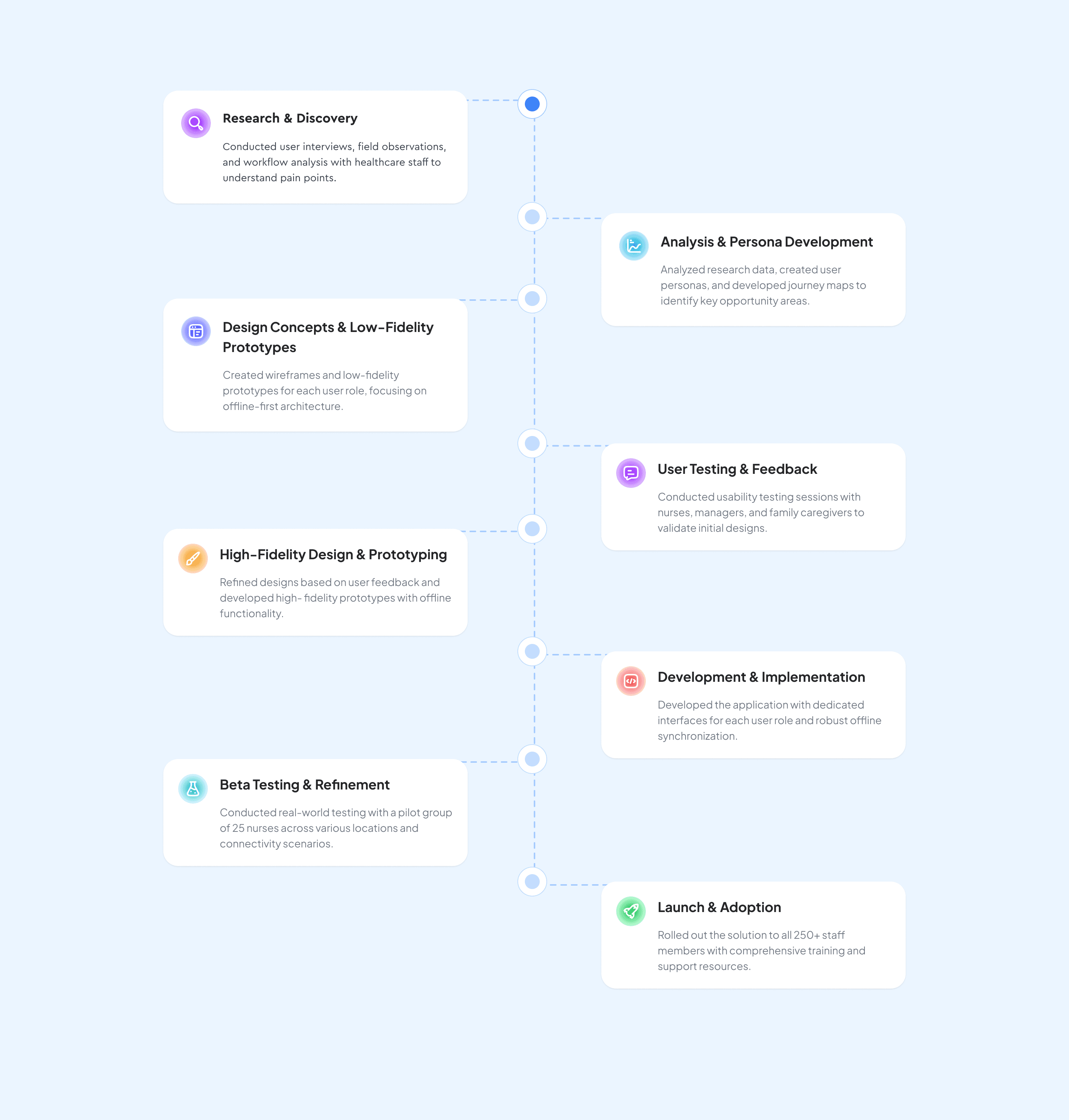
Before & After Comparison
Jordan Healthcare 1.0 offered basic scheduling and documentation, but it wasn’t built for real-world home visits. Nurses struggled with unreliable sync, disconnected tools, and zero offline support. The redesign focused on creating a stable, mobile-ready platform that keeps caregivers productive even in unpredictable field conditions.
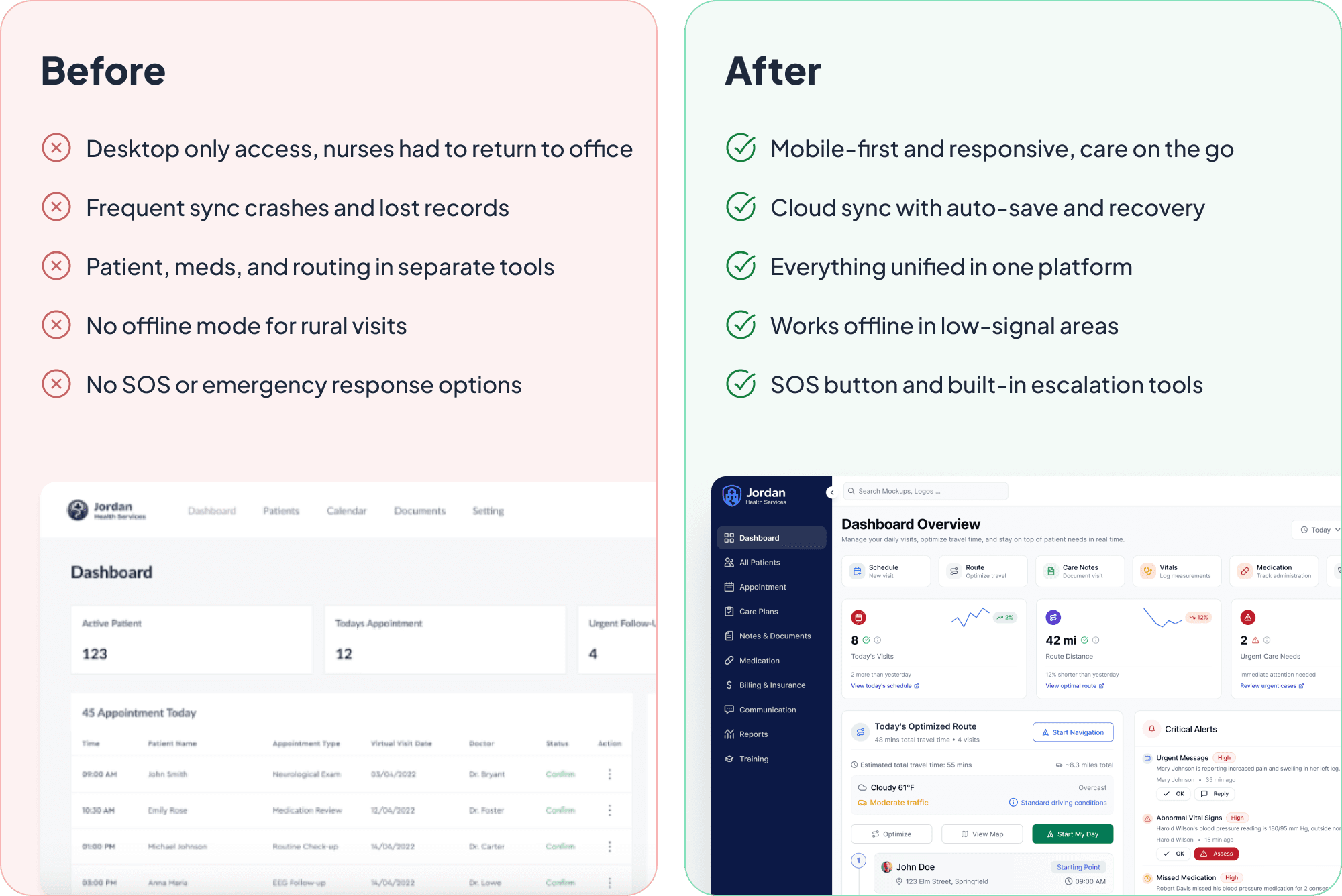
Research Approach
To ground the redesign in real workflows, we conducted interviews, shadowing sessions, and usability reviews with nurses, coordinators, and clinical supervisors. This mix of qualitative and contextual research helped us understand the daily pressures of home care and uncover the root causes behind recurring errors and inefficiencies.
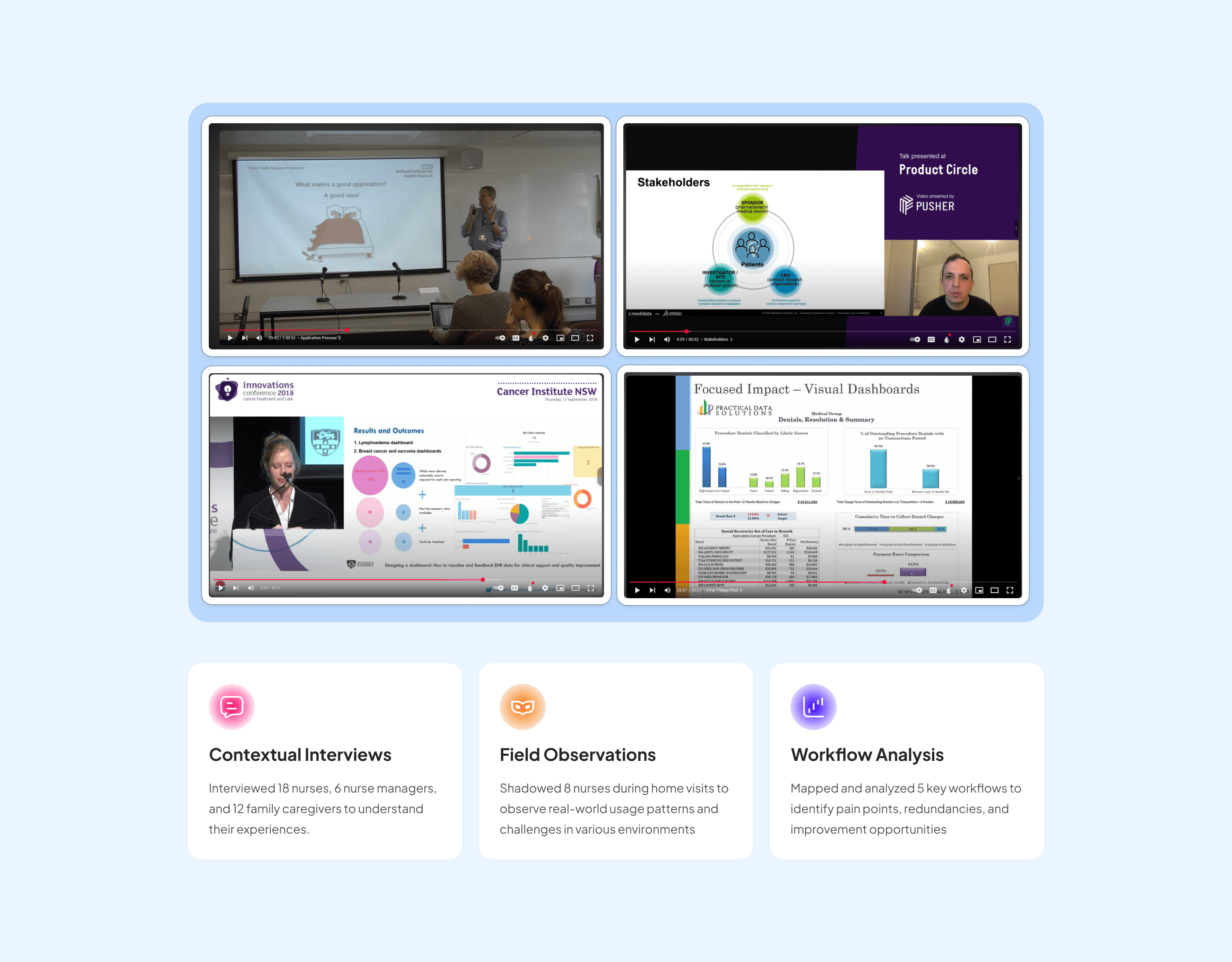
User Persona
Our primary persona is the home-care nurse, someone managing tight schedules, long travel routes, and complex patient needs. By mapping their daily journey, we identified critical pain points around navigation, documentation, medication safety, and emergency readiness.
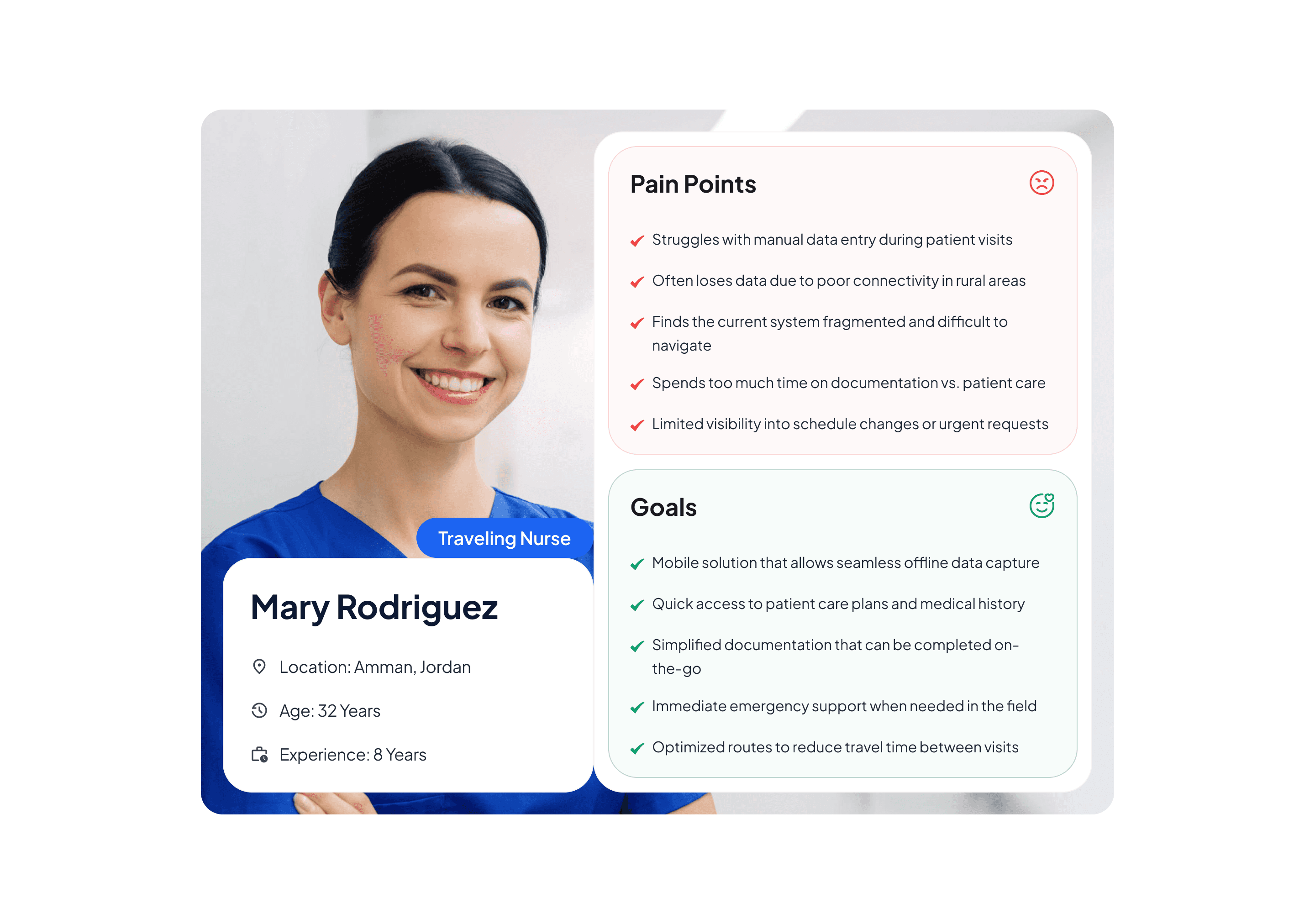
User Persona
Our primary persona is the home-care nurse, someone managing tight schedules, long travel routes, and complex patient needs. By mapping their daily journey, we identified critical pain points around navigation, documentation, medication safety, and emergency readiness.
Research Insights
Nurses needed faster access to patient context, clearer alerts, simplified documentation, and a system that works even without connectivity. These insights shaped every design decision, from dashboard prioritization to route guidance and medication workflows.
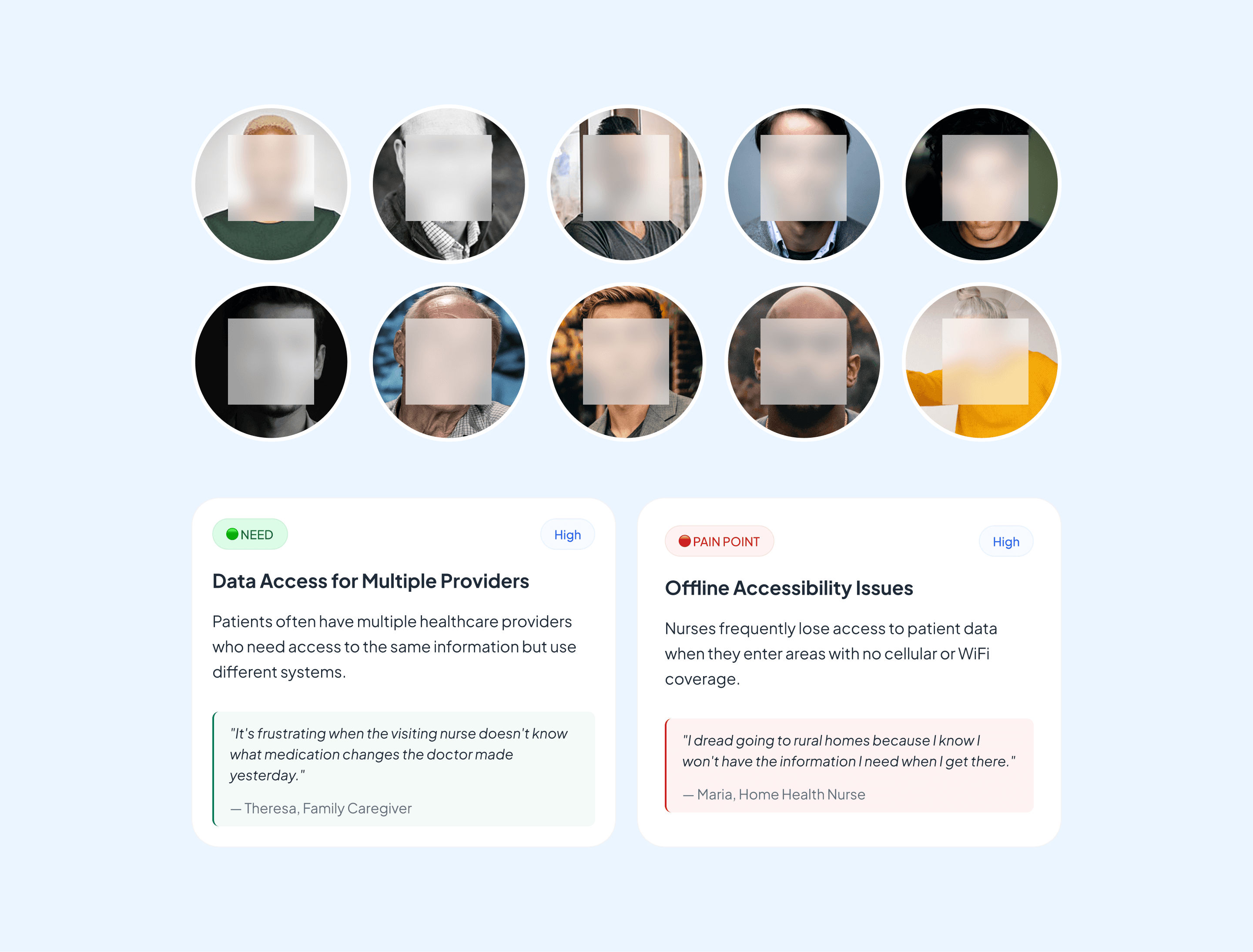
Research Insights
Nurses needed faster access to patient context, clearer alerts, simplified documentation, and a system that works even without connectivity. These insights shaped every design decision, from dashboard prioritization to route guidance and medication workflows.
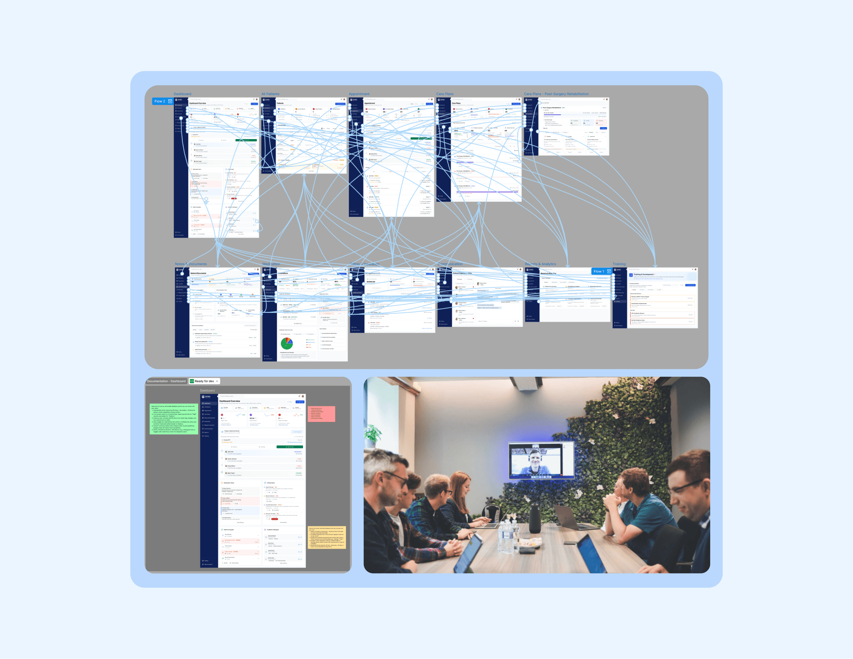
User Flow
The original product grew feature-by-feature over several years, which led to tangled navigation and duplicated paths. We rebuilt the flow from scratch, based on how nurses described their actual day. The new structure removes unnecessary branching, reduces context switching, and puts critical paths, like visit prep, routing, and documentation within immediate reach.
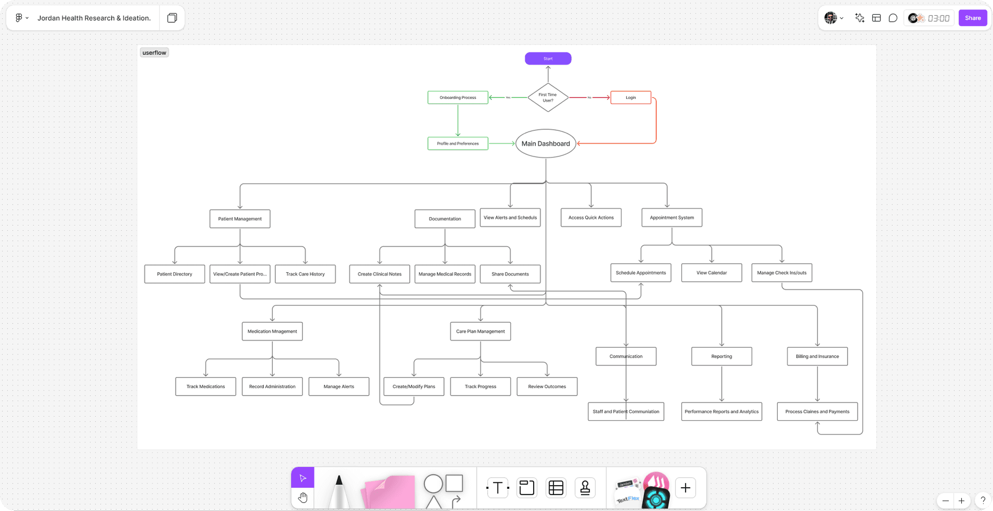
Wireframes
Wireframes intentionally stayed low-fidelity until we had enough validation from the field. This allowed us to test pagination behaviors, visit sequencing, alert hierarchy, and offline expectations without getting stuck on visual details. The conversations that came out of these sessions surfaced edge cases we wouldn’t have uncovered through requirements alone.
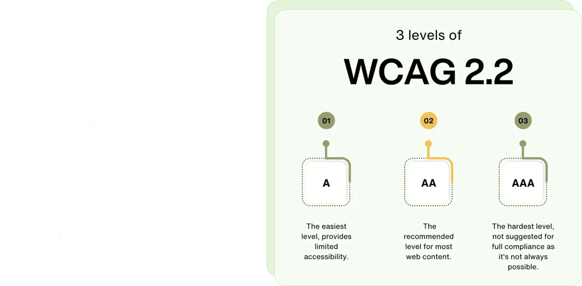
Accessibility Considerations (WCAG)
Because nurses often work outdoors, in vehicles, or in patients’ dimly lit homes, accessibility wasn’t a checklist item—it was a usability requirement. We focused on practical improvements: stronger color contrast for outdoor visibility, clearer text hierarchy, larger touch targets, and predictable keyboard/screen-reader behavior for clinical workstations.

Collaboration with Developers
The redesign touched nearly every part of the system, so close partnership with engineering was essential. We worked in parallel designing interaction models while engineers validated data constraints, offline behavior, and state logic. Weekly design dev reviews helped us catch dependency issues early and refine flows before they became expensive to rework.
Universal Component System
I built a modular component system to support a product that spans scheduling, routing, care plans, documentation, and analytics. Every component was designed to adapt to different contexts cards that compress on mobile, alerts that shift between passive and urgent states, and documentation tools that scale from quick notes to detailed assessments. This system became the foundation for building consistently and accelerating future releases.
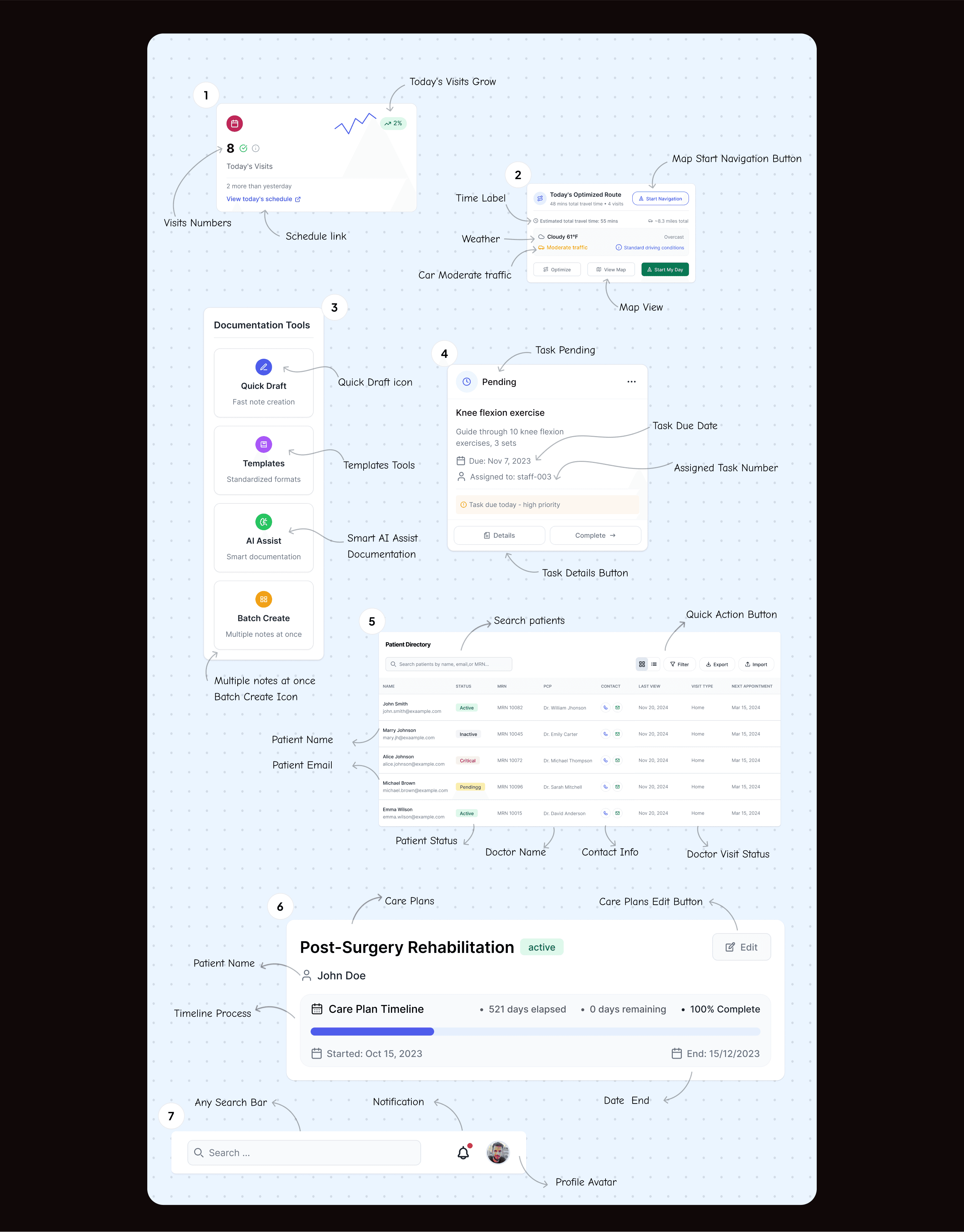
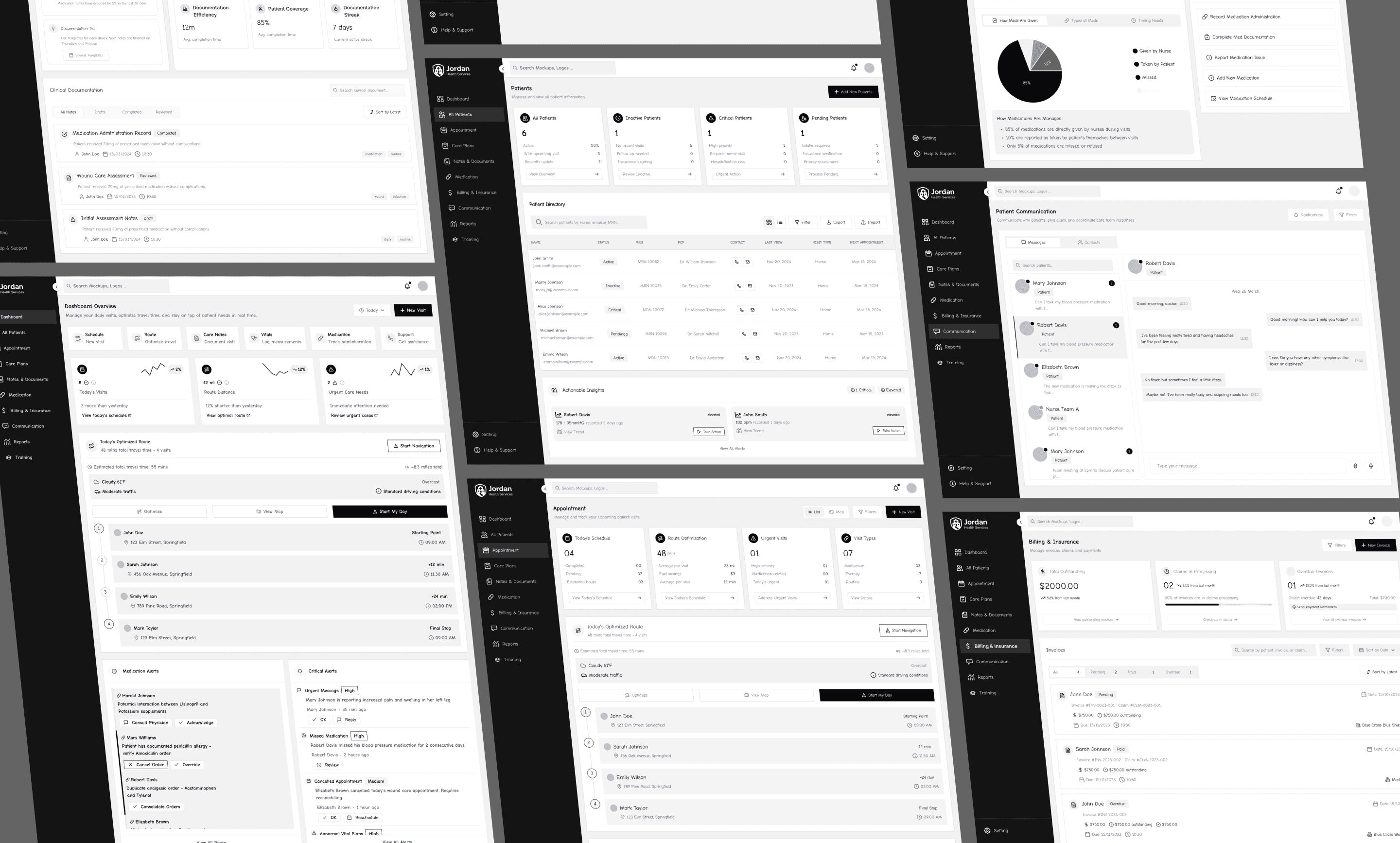
Dashboard
The new Dashboard Overview for Jordan Health Services is designed specifically for nurses and caregivers who conduct home visits. It offers a consolidated, real-time view of daily visits, route planning, patient alerts, and medication tracking—all in one accessible, responsive layout. This redesign aims to reduce cognitive load, minimize manual effort, and empower healthcare professionals with smarter tools to make informed decisions on the go.
By focusing on contextual information, efficiency-driven actions, and real-world constraints like weather, traffic, and medication alerts, the dashboard becomes a practical command center that enhances patient care and nurse productivity.
Patients
This redesigned patient view simplifies care coordination by organizing all patient statuses (active, inactive, critical, pending) into clearly labeled categories. Nurses and staff can now quickly assess, filter, and act on what matters most without digging through cluttered lists.
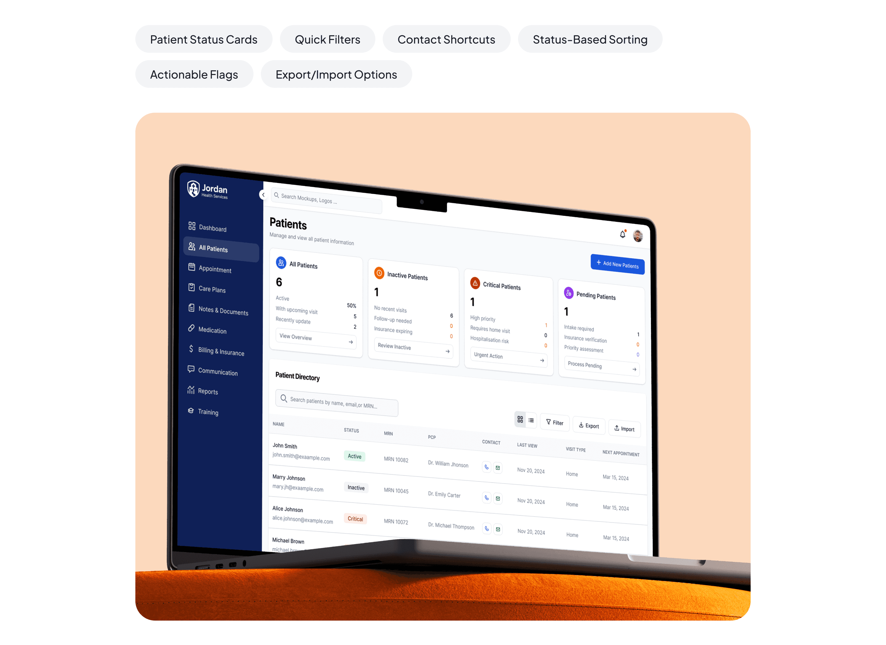
Patients
This redesigned patient view simplifies care coordination by organizing all patient statuses (active, inactive, critical, pending) into clearly labeled categories. Nurses and staff can now quickly assess, filter, and act on what matters most without digging through cluttered lists.
Appointment
The redesigned appointment screen brings together optimized routing, visit insights, and real-time urgency tracking. Nurses can plan their day with full visibility into patient needs, estimated travel time, and appointment types all on one screen.
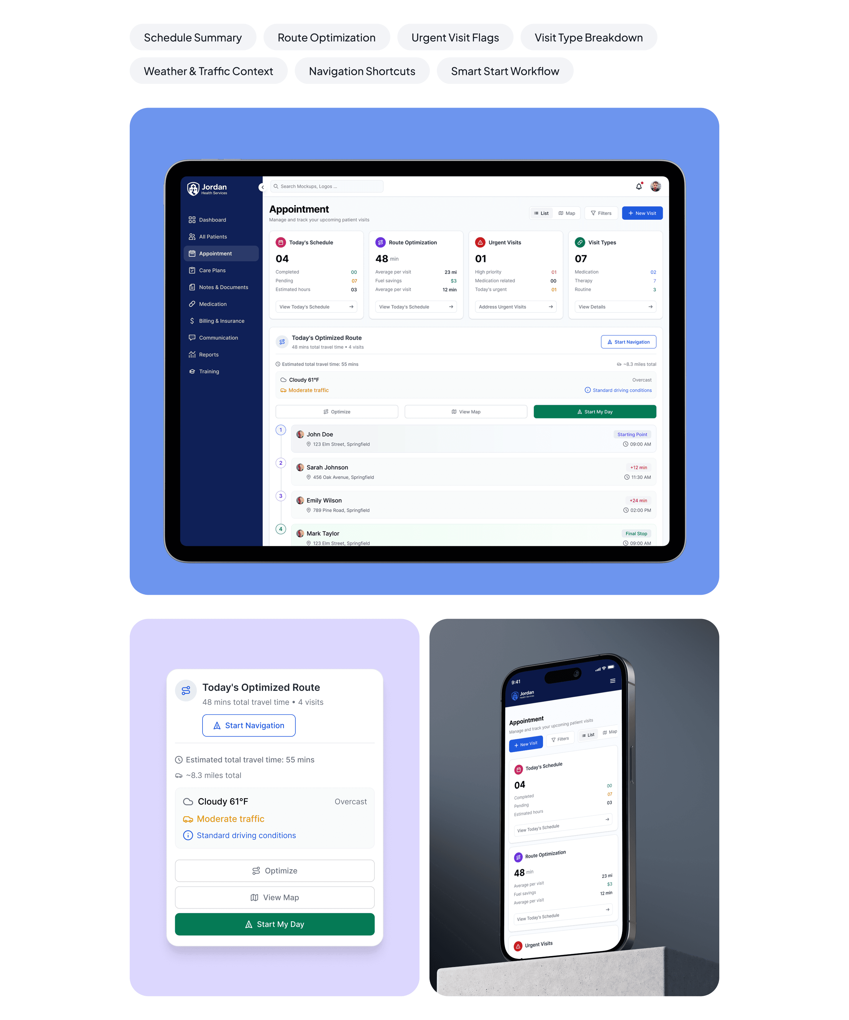
Appointment
The redesigned appointment screen brings together optimized routing, visit insights, and real-time urgency tracking. Nurses can plan their day with full visibility into patient needs, estimated travel time, and appointment types all on one screen.
Care Plans
The redesigned appointment screen brings together optimized routing, visit insights, and real-time urgency tracking. Nurses can plan their day with full visibility into patient needs, estimated travel time, and appointment types all on one screen.
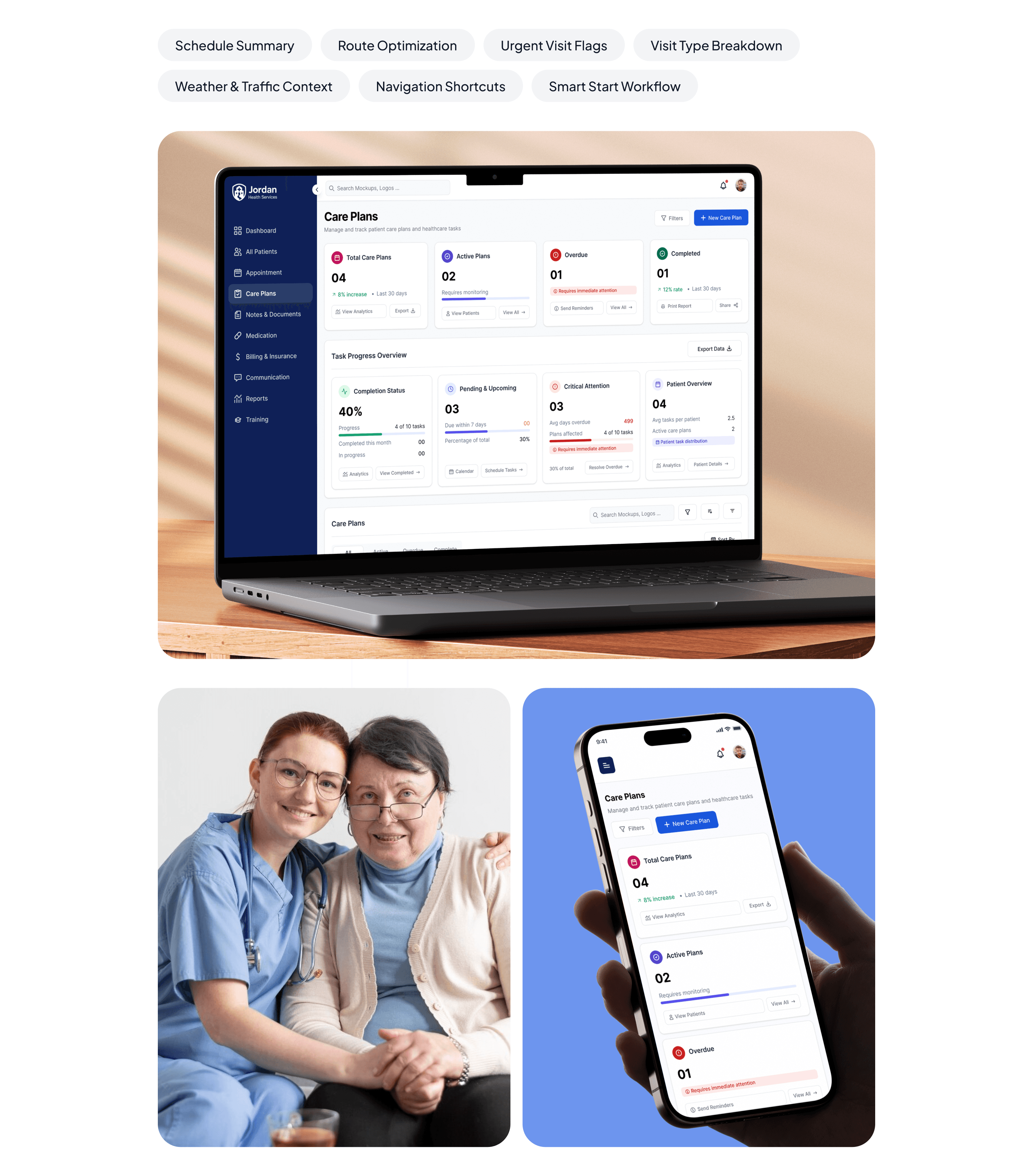
Care Plans
The redesigned appointment screen brings together optimized routing, visit insights, and real-time urgency tracking. Nurses can plan their day with full visibility into patient needs, estimated travel time, and appointment types all on one screen.
Usability Test
Visualizing the quantifiable improvements from our redesign across key metrics

Usability Test
Visualizing the quantifiable improvements from our redesign across key metrics
Impact Dashboard
Visualizing the quantifiable improvements from our redesign across key metrics

Impact Dashboard
Visualizing the quantifiable improvements from our redesign across key metrics