Overwatch Digital Health Platform
Overwatch Digital Health Platform
Overwatch Digital Health Platform
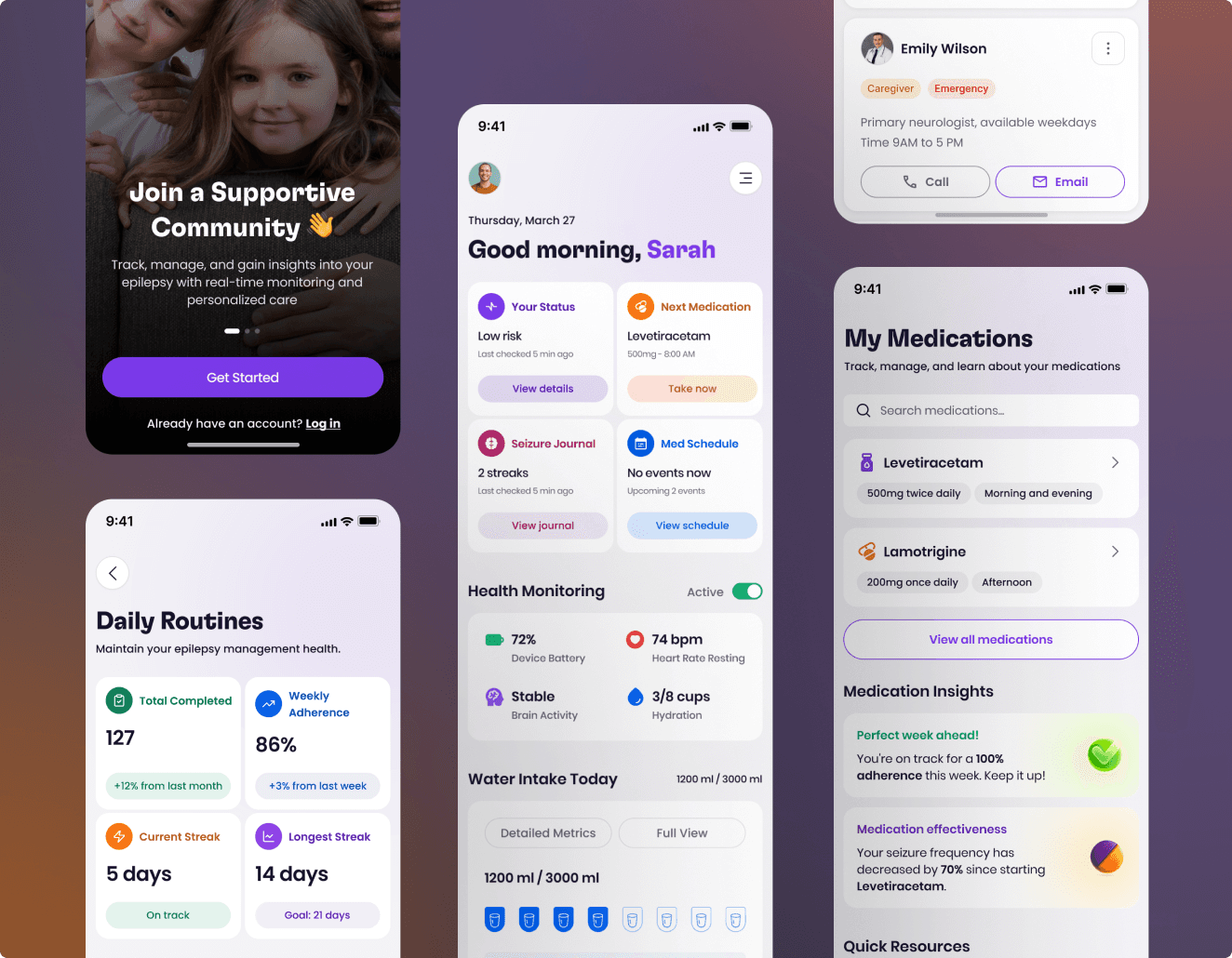
Mobile App
Mobile App
Mobile App
Overview
Overview
Overwatch is a seizure-detection and safety app supporting people with epilepsy and their caregivers. The system uses motion signals, lightweight ML models, and real-time location sharing to trigger alerts when a user may be experiencing a seizure helping prevent unattended or delayed responses.
Overwatch is a seizure-detection and safety app supporting people with epilepsy and their caregivers. The system uses motion signals, lightweight ML models, and real-time location sharing to trigger alerts when a user may be experiencing a seizure helping prevent unattended or delayed responses.
Despite early traction (6,500+ monthly users, 18% alert-to-intervention rate), the original experience lacked clarity and trust. Users struggled to understand what was being detected, where information lived, and how reliable alerts were. This led to 31% onboarding drop-off and fragmented caregiver response.
Despite early traction (6,500+ monthly users, 18% alert-to-intervention rate), the original experience lacked clarity and trust. Users struggled to understand what was being detected, where information lived, and how reliable alerts were. This led to 31% onboarding drop-off and fragmented caregiver response.
Tech Stack

Figma
Design Tool

React Native
User Interface Library

Xcode
IDE
Tech Stack
Figma
Design Tool
React Native
User Interface Library
Xcode
IDE
Tech Stack
Figma
Design Tool
React Native
User Interface Library
Xcode
IDE
ROLE
ROLE
UX Designer & Researcher
DURATION
DURATION
8 Month
PLATFORM
PLATFORM
Medical Service
Process
Process
Design Process
My design process for the Overwatch Digital Health app was rooted in iteration and empathy. I began by engaging with users to understand their daily challenges, which shaped the creation of personas and journey maps. These insights became the foundation for early wireframes and prototypes.
Through ongoing usability testing, I refined the designs to improve clarity, usability, and alignment with clinical needs. Close collaboration with developers and healthcare professionals ensured that the solutions were not only intuitive but also practical and clinically relevant. The result was a design that empowers users while effectively supporting epilepsy management.
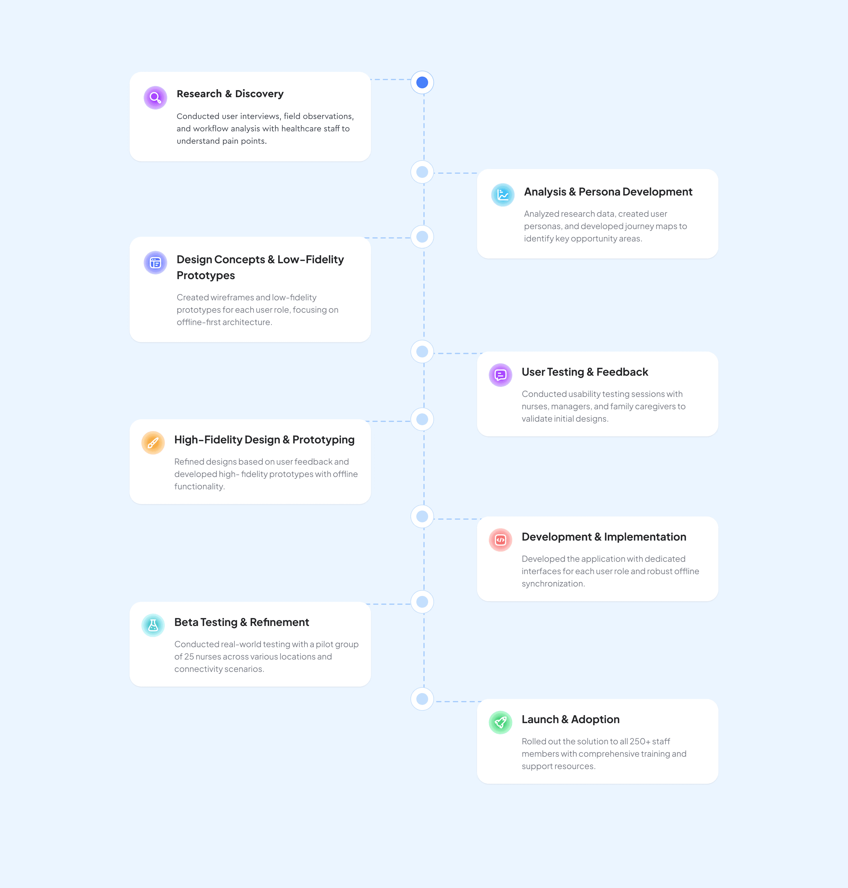
Before & After Comparison
The Before version feels more static and text-heavy, while the After redesign is structured, dynamic, and prioritizes key metrics at a glance. The redesign follows modern health app patterns (dashboard style), giving users more actionable insights upfront.
Before
6,500+ active users relying on the app monthly
18% of alerts resulted in a caregiver intervention, validating real-world usefulness
But also 42% of users reported difficulty understanding what the app was detecting, and 31% dropped off within the first 7 days due to unclear onboarding, scattered information, and inconsistent alert feedback.
After
24% faster caregiver response time
36% improvement in user confidence (self-reported)
Reduced onboarding drop-off by 19%
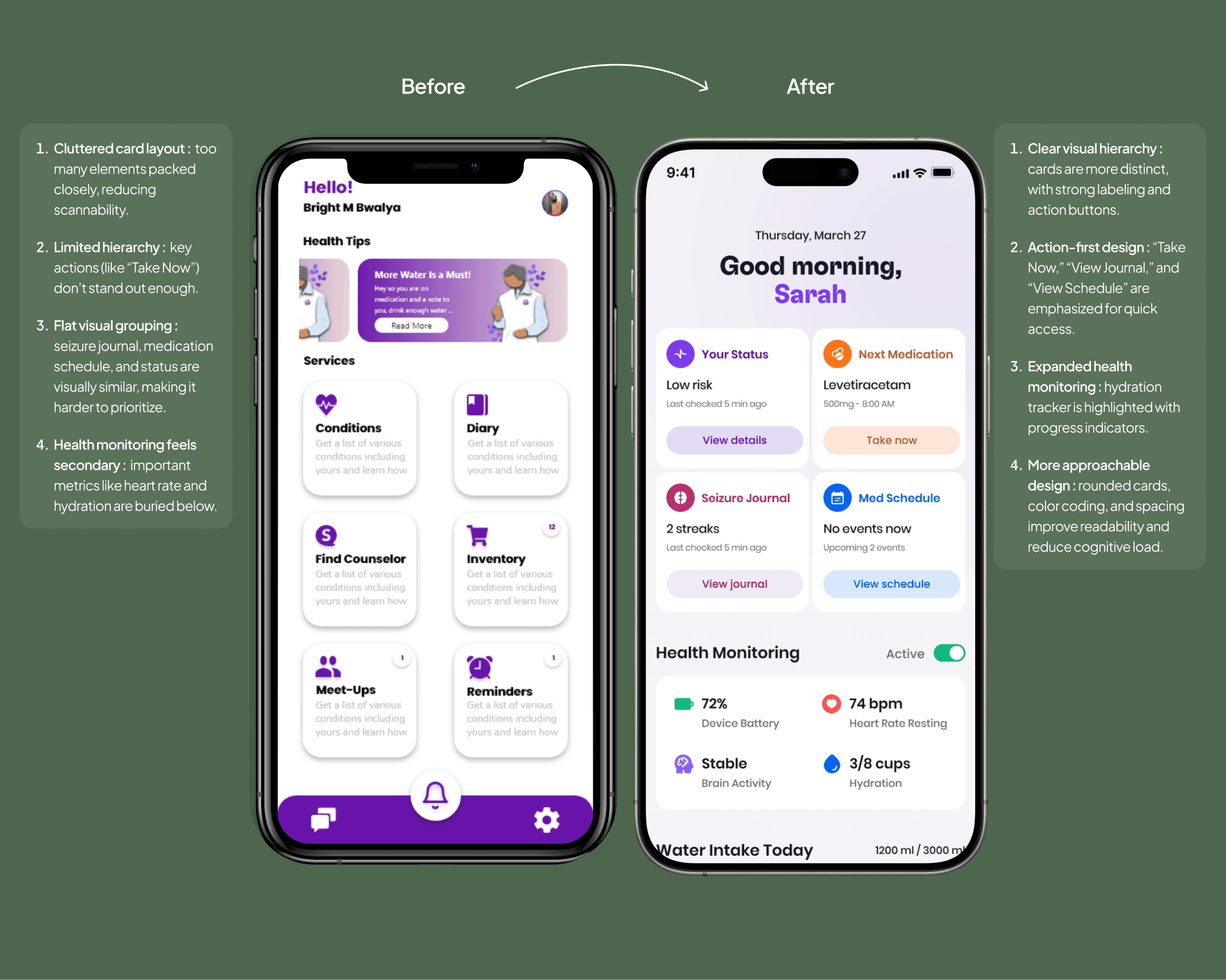
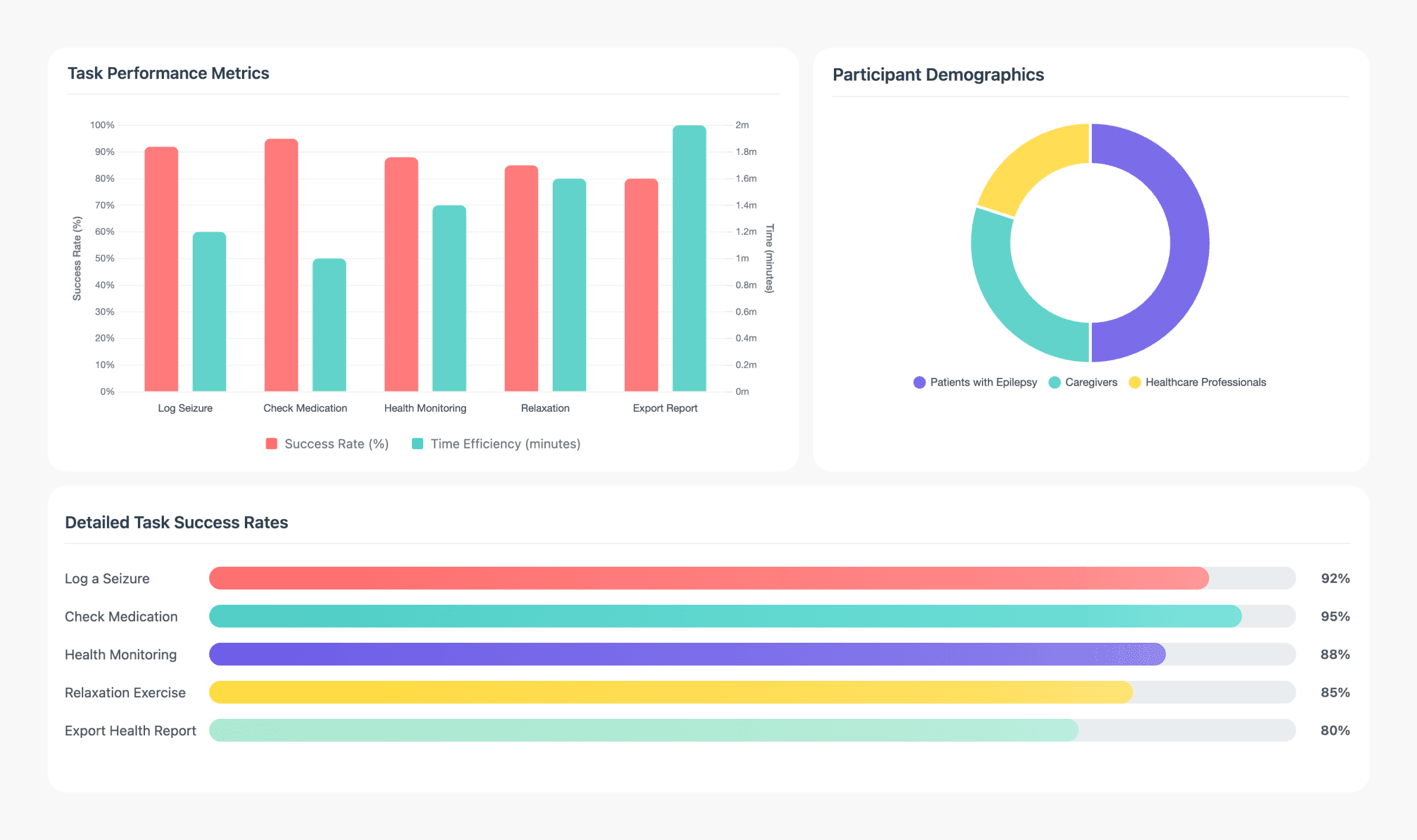
Quantitative Research
Our usability study highlighted where the previous experience was slowing users down and where the redesign made measurable impact. After improvements, the task error rate dropped to 12%, and average task time decreased to 1.3 minutes, showing clearer navigation and faster comprehension. User trust also improved, reflected in a 76% NPS, the highest recorded for the product.
Two minor non-critical issues were noted sync delays with wearables and minor UI overlaps neither affecting task completion, but providing direction for future refinements.
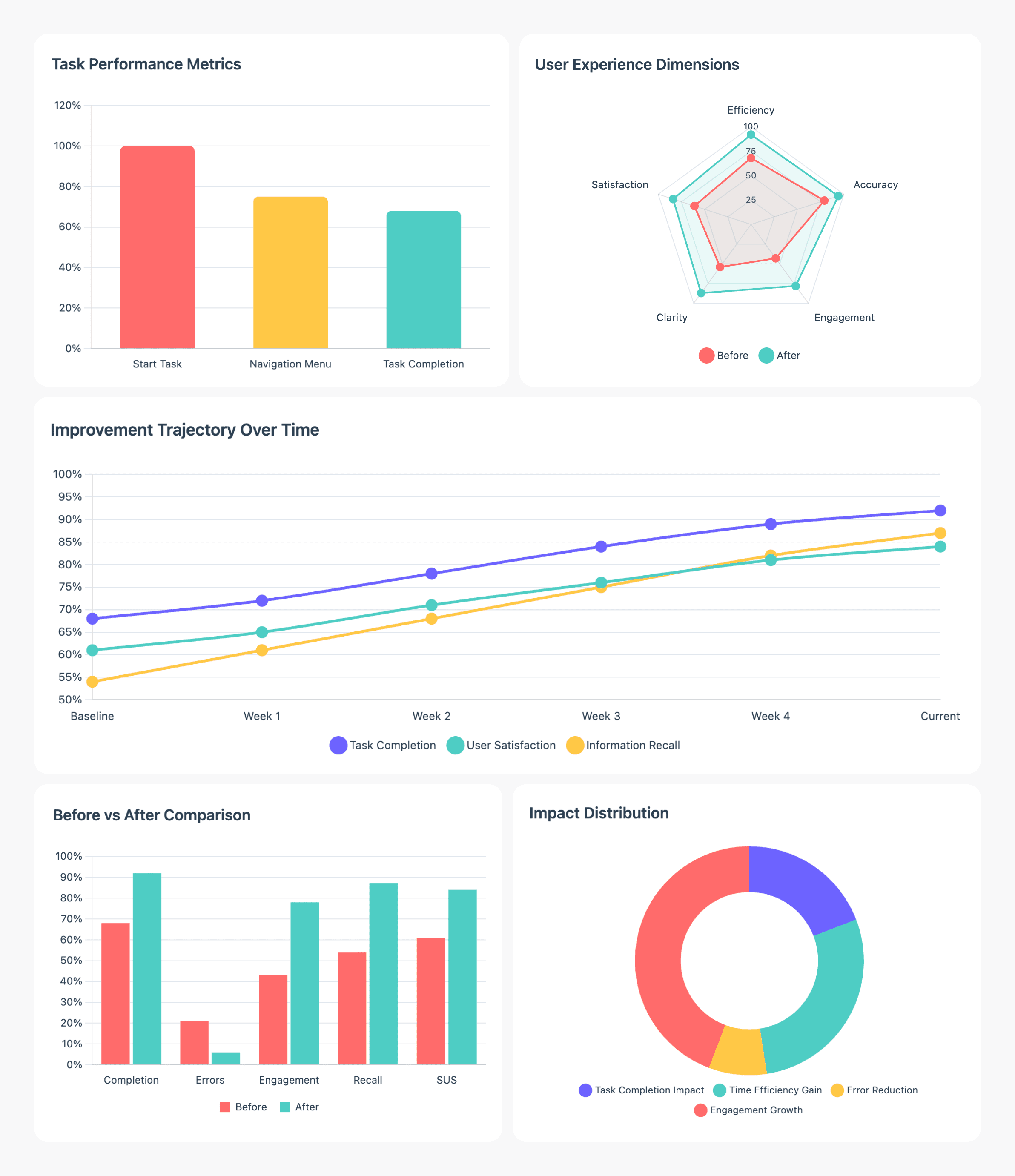
User Persona
I developed two personas grounded in survey responses and interview patterns not as fictional profiles but as representations of recurring needs and constraints. These personas helped us prioritize features that directly support real-life epilepsy management: clear symptom tracking, predictable logging flows, and quick access to caregiver support. They became the guiding reference during design trade-offs, especially around information hierarchy and alert communication.
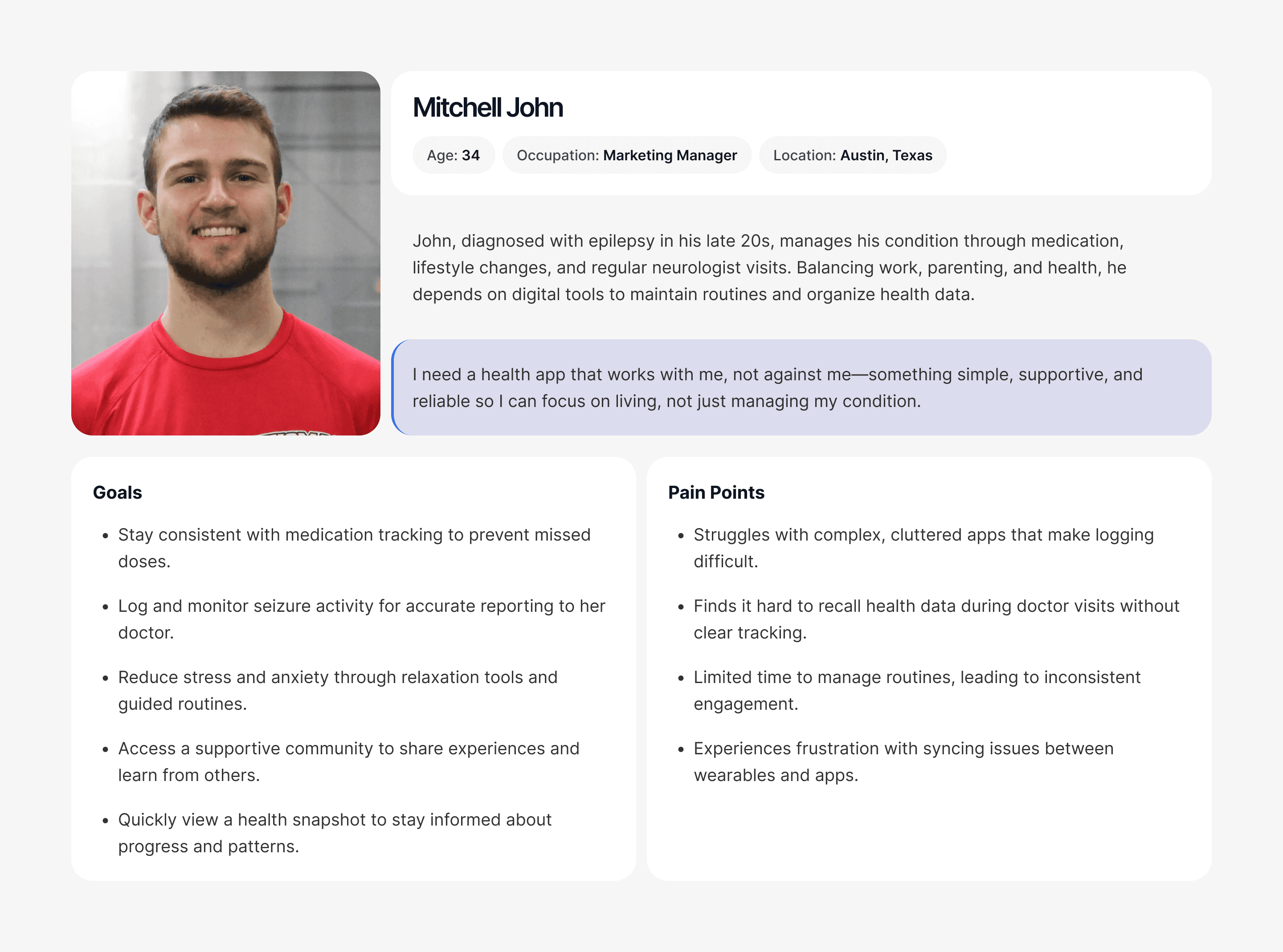
User Survey
Survey responses showed that our most active segment users aged 25–34 treat the app as part of their daily health routine. While basic navigation felt manageable, the biggest pain points were slow seizure reporting and overly manual input steps. Requests for voice-to-text logging, simpler forms, and clearer insight summaries reinforced that the redesign needed to reduce cognitive load and support faster, real-life use.
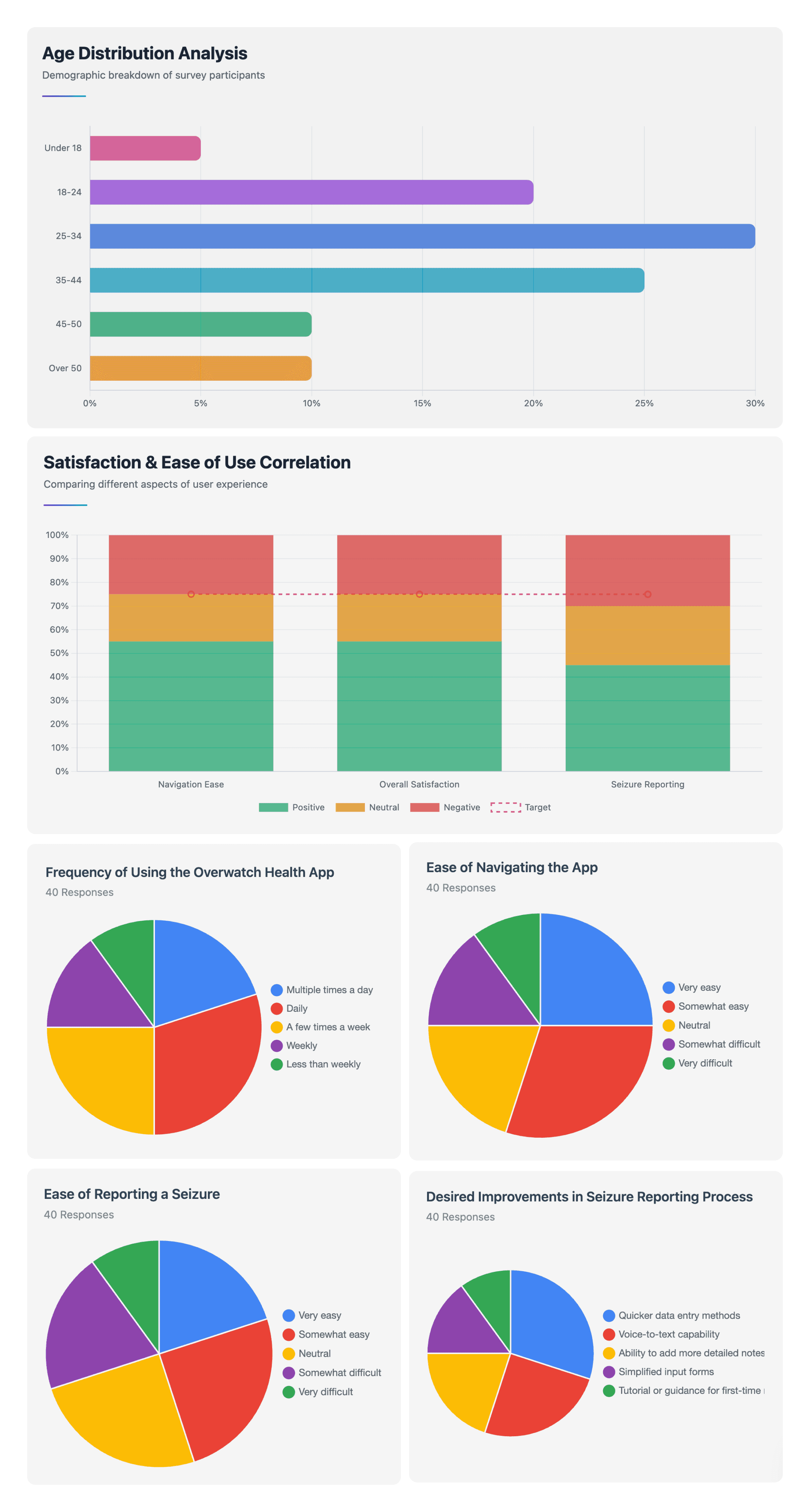
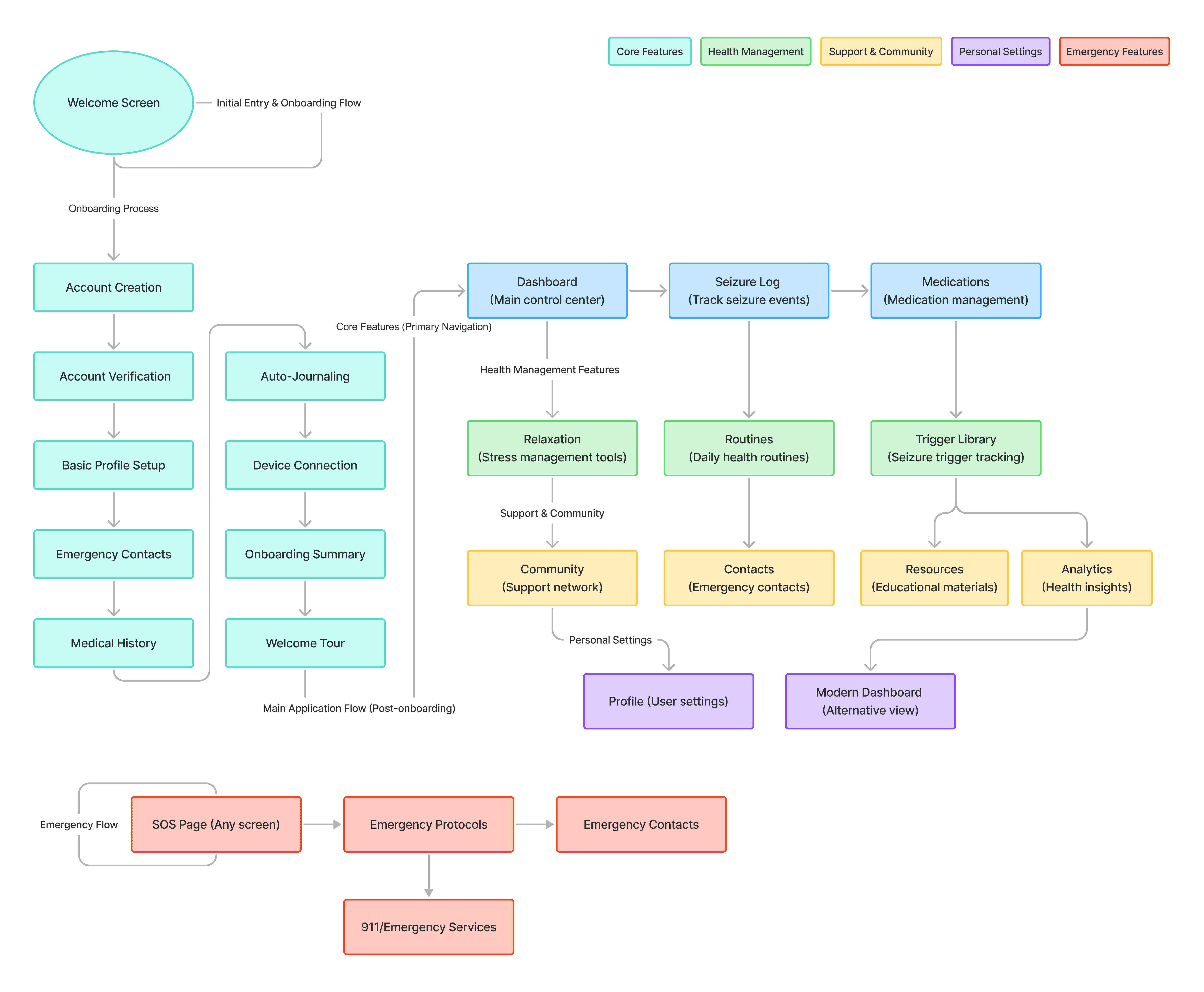
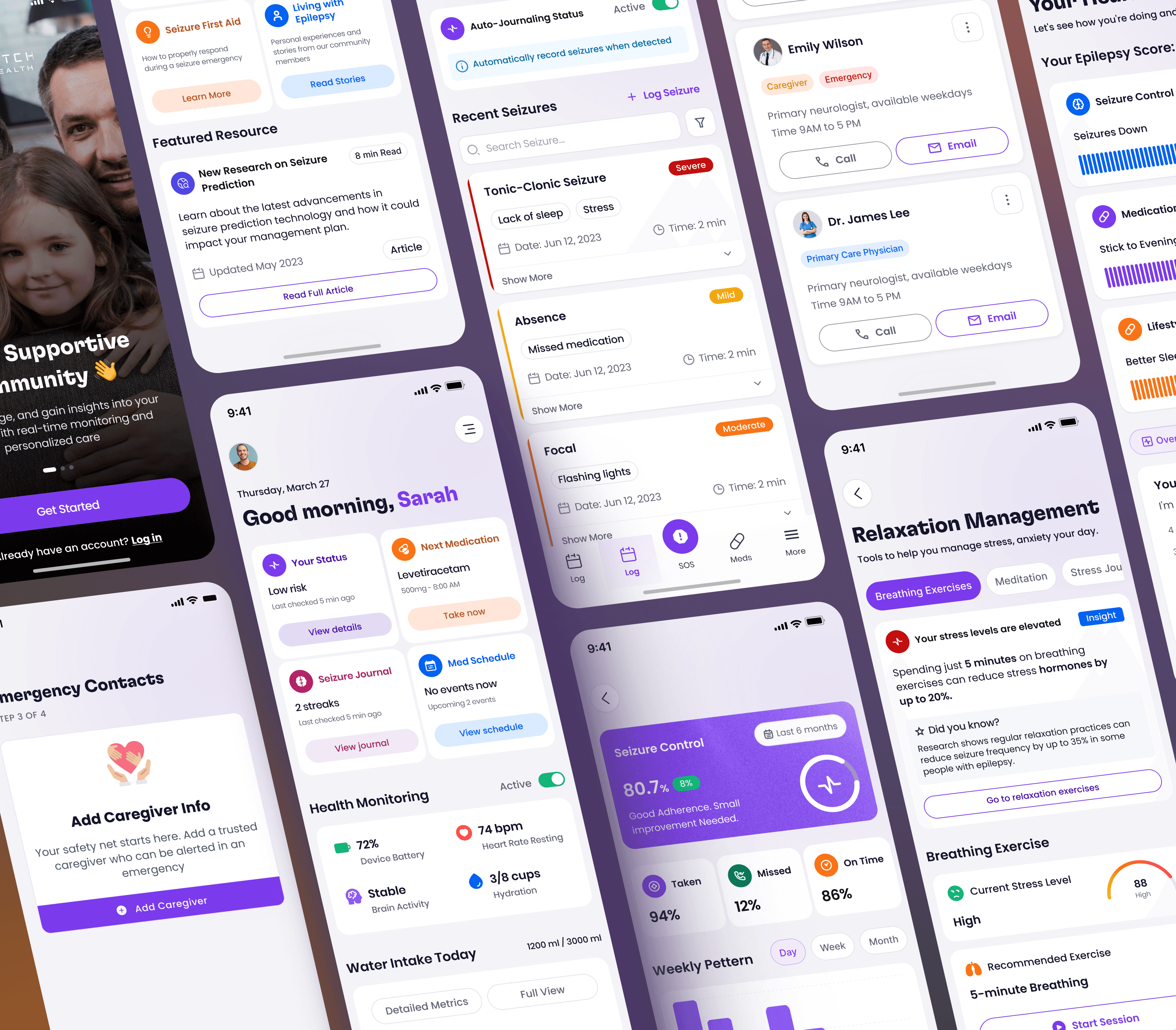
User Flow
The user flow for the Overwatch Digital Health app maps the journey from onboarding to daily engagement. Starting at the splash screen, users can sign up, log in, and complete profile setup, including device integration and notification preferences.
From the dashboard, they access key features such as medication reminders, seizure logging, daily routines, and stress management tools. Users can also explore the community hub, track progress through reports and insights, and connect with caregivers or doctors via contacts.
This streamlined flow ensures users can log health data, manage medications, reduce stress, and access support within a single, integrated experience.
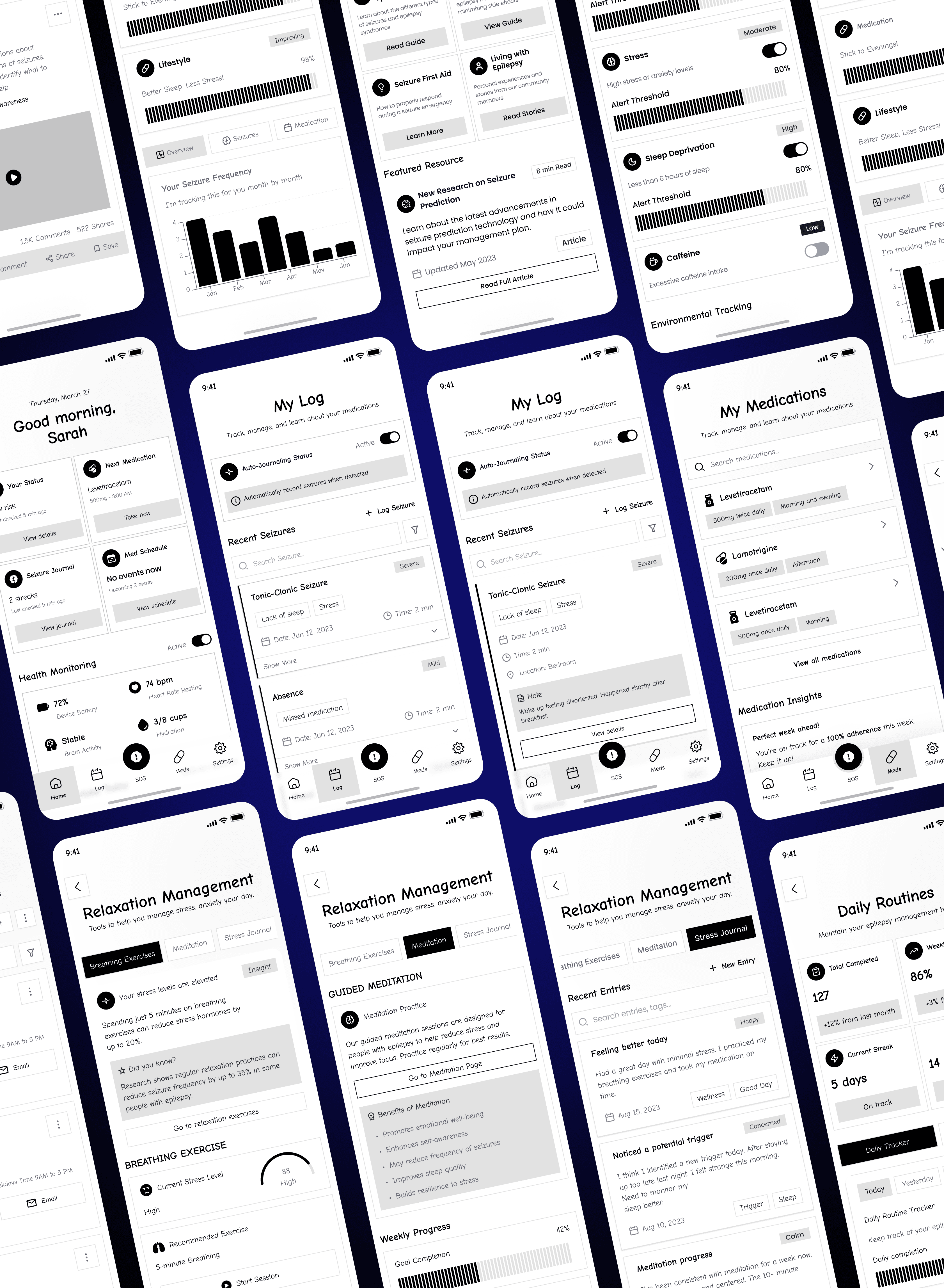
Wireframe
The wireframes explore how the redesigned structure translates into real interactions: simpler logs, clearer medical summaries, more accessible emergency actions, and smoother paths between daily routines and insights. Each screen is designed to reduce friction and make essential information easy to read at a glance. The goal at this stage was not visual polish, but verifying that the system supports users’ actual behavior patterns and reduces the effort needed to stay consistent.
Design System
I created a modular design system built around clarity and reliability two qualities that matter most in a health-critical context. Components were designed for consistency across charts, logs, cards, and alerts, ensuring users never need to relearn interactions. The system also scales easily, making future clinical features or third-party integrations straightforward to add without compromising accessibility or readability.
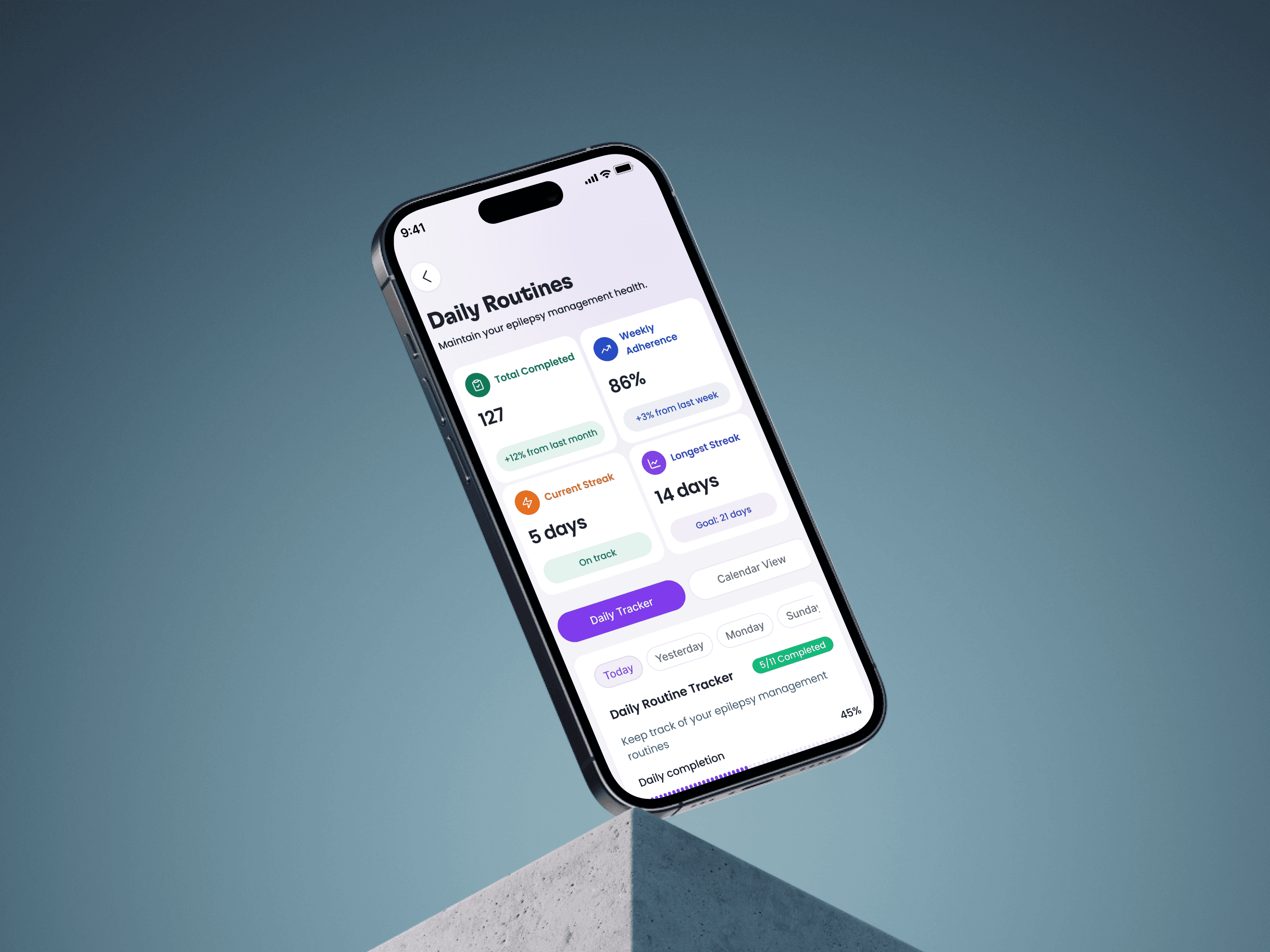
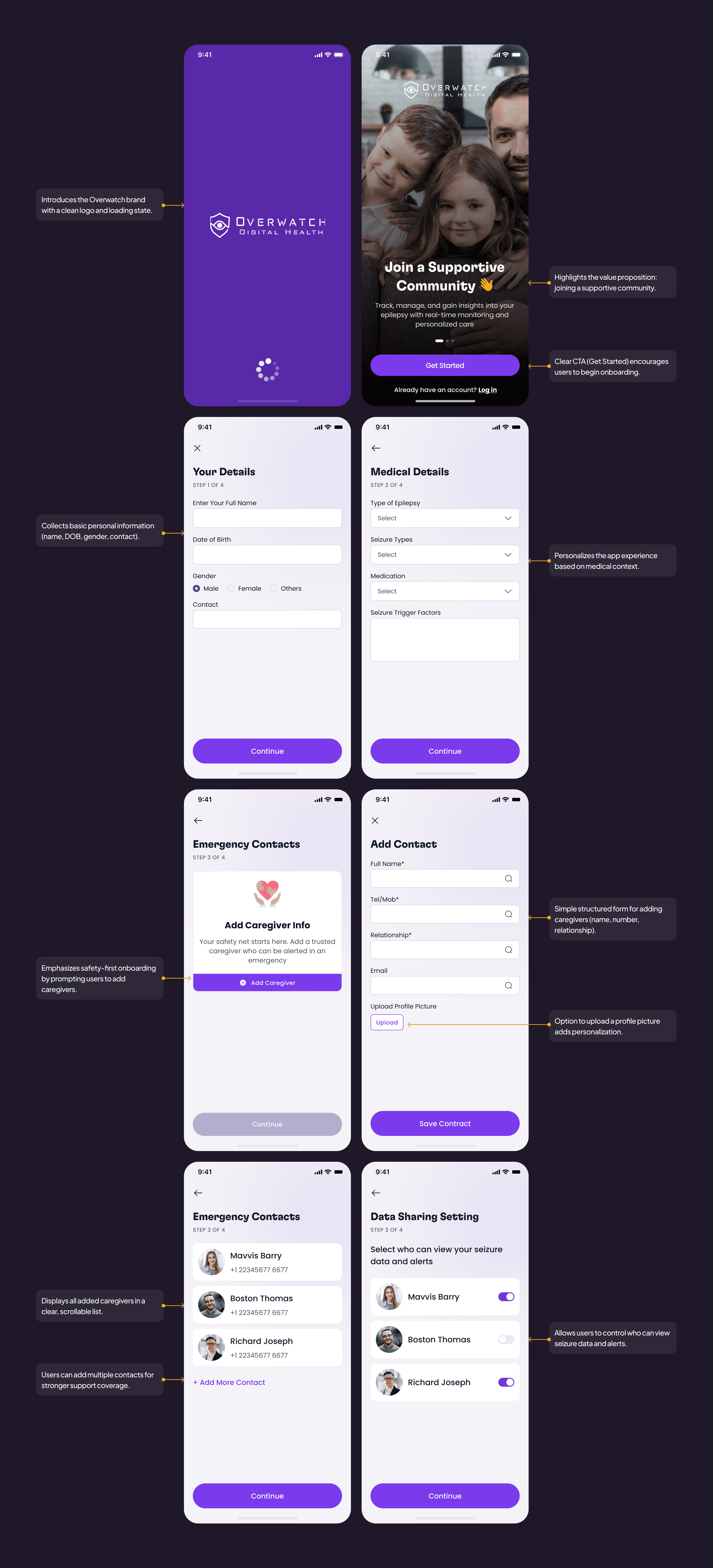
Simplifying Onboarding
This onboarding flow balances simplicity, safety, and personalization, ensuring users feel supported and confident from their very first interaction.
Key Improvements:
Clear, welcoming first screen that sets expectations and builds trust.
Four simple steps that keep progress visible and prevent overwhelm.
Essential medical details captured only where they directly inform insights.
Early setup of emergency contacts to ensure readiness from day one.
Transparent data-sharing controls that reinforce security and user agency.
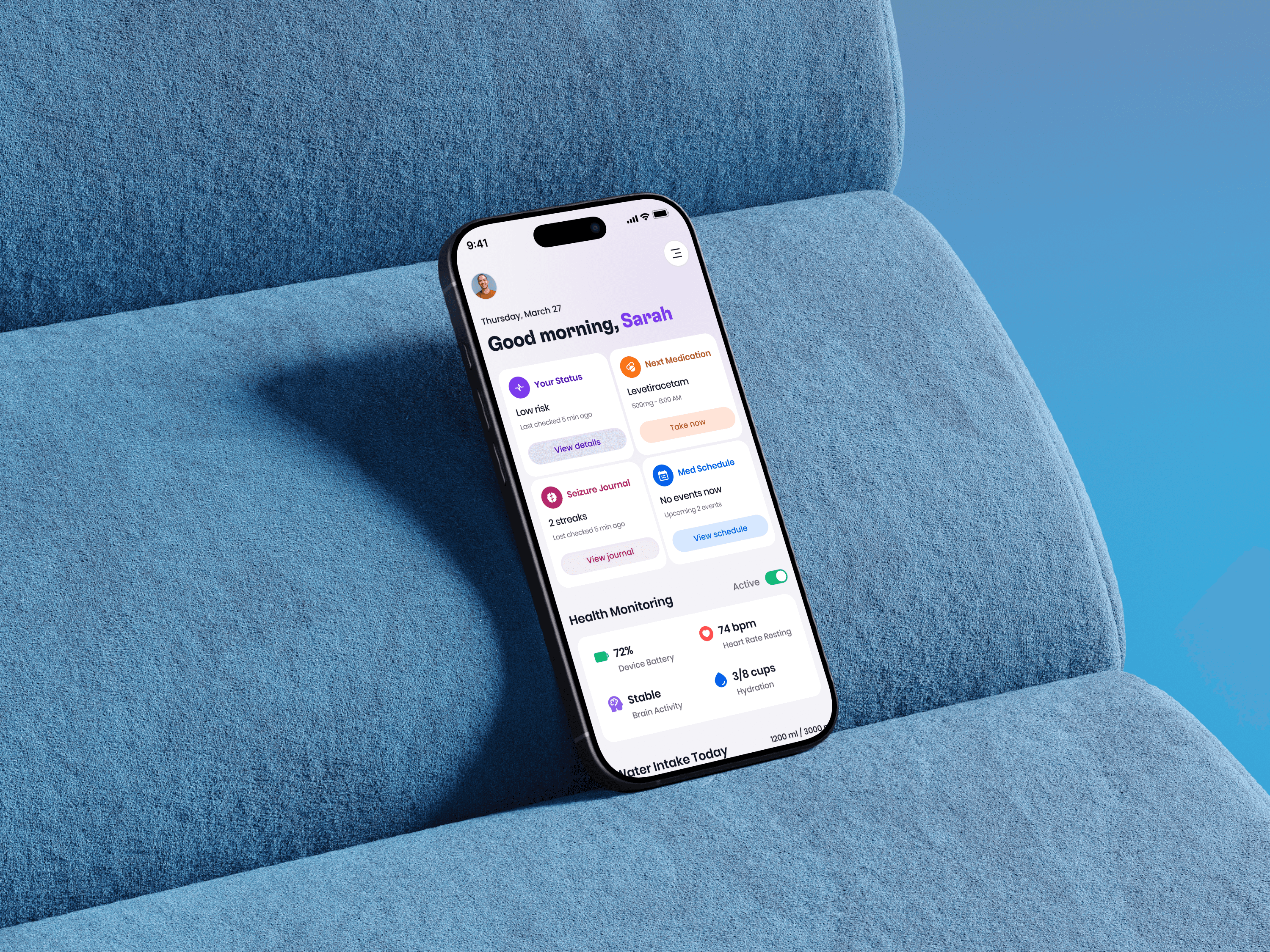
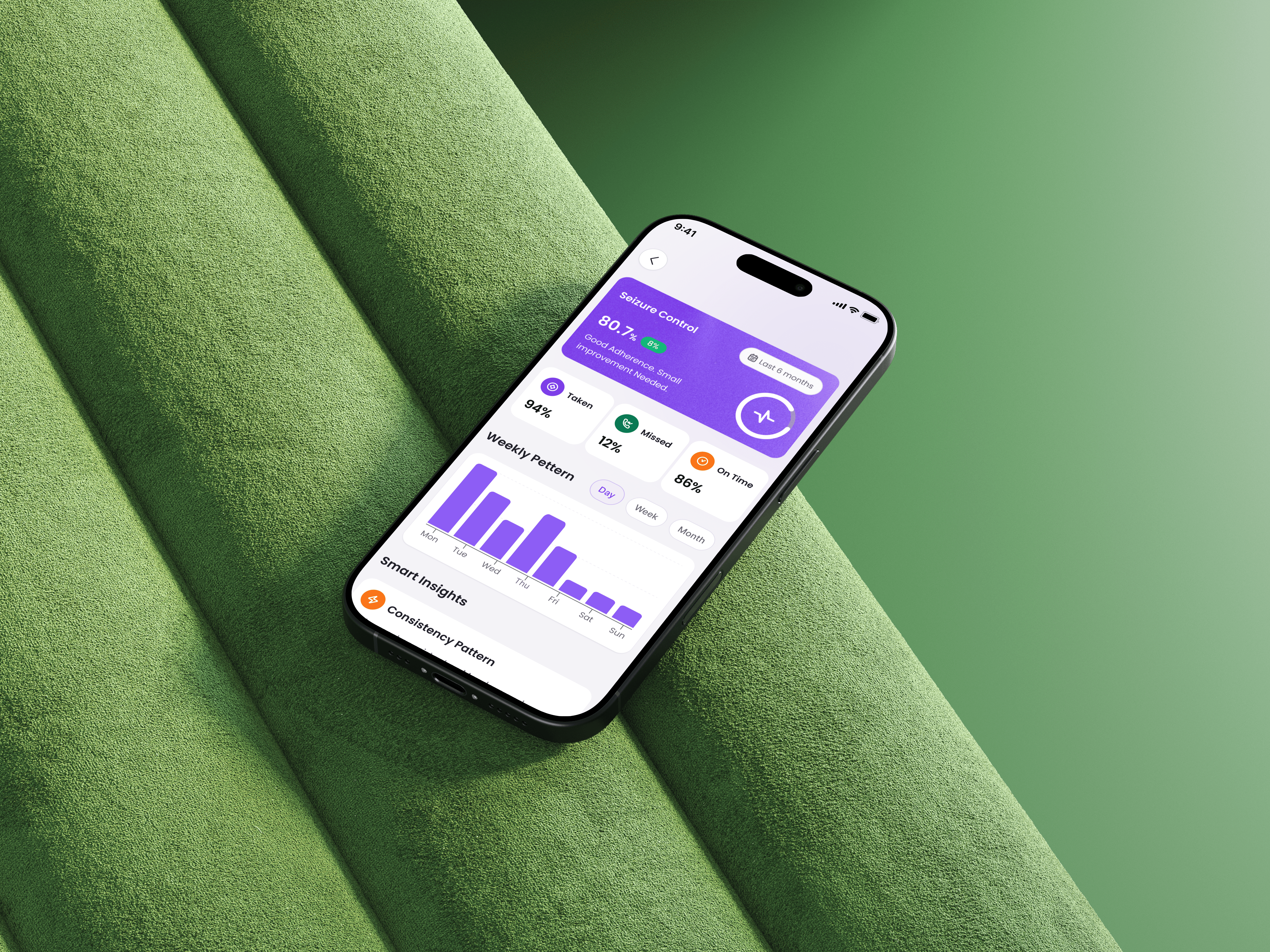
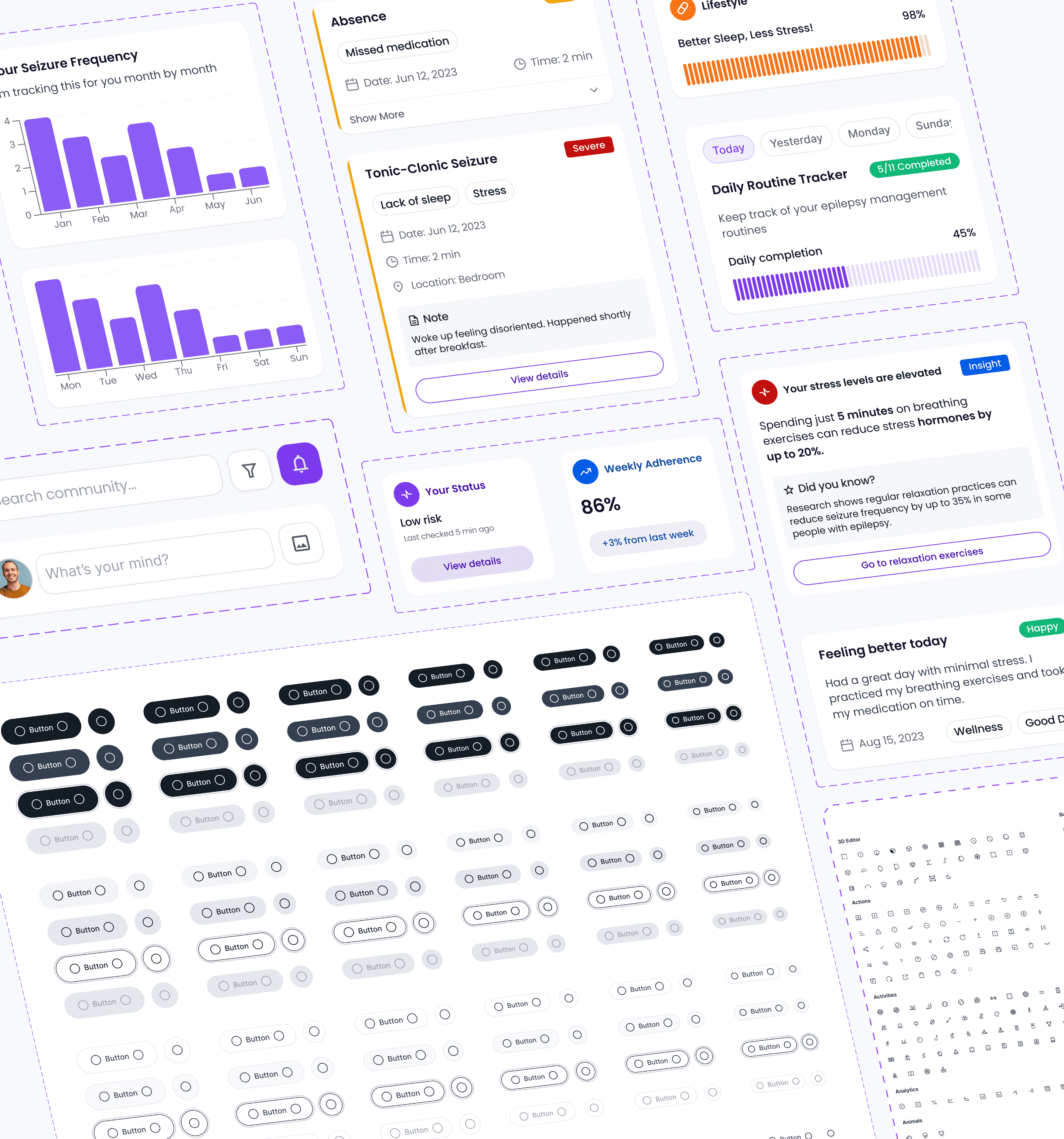
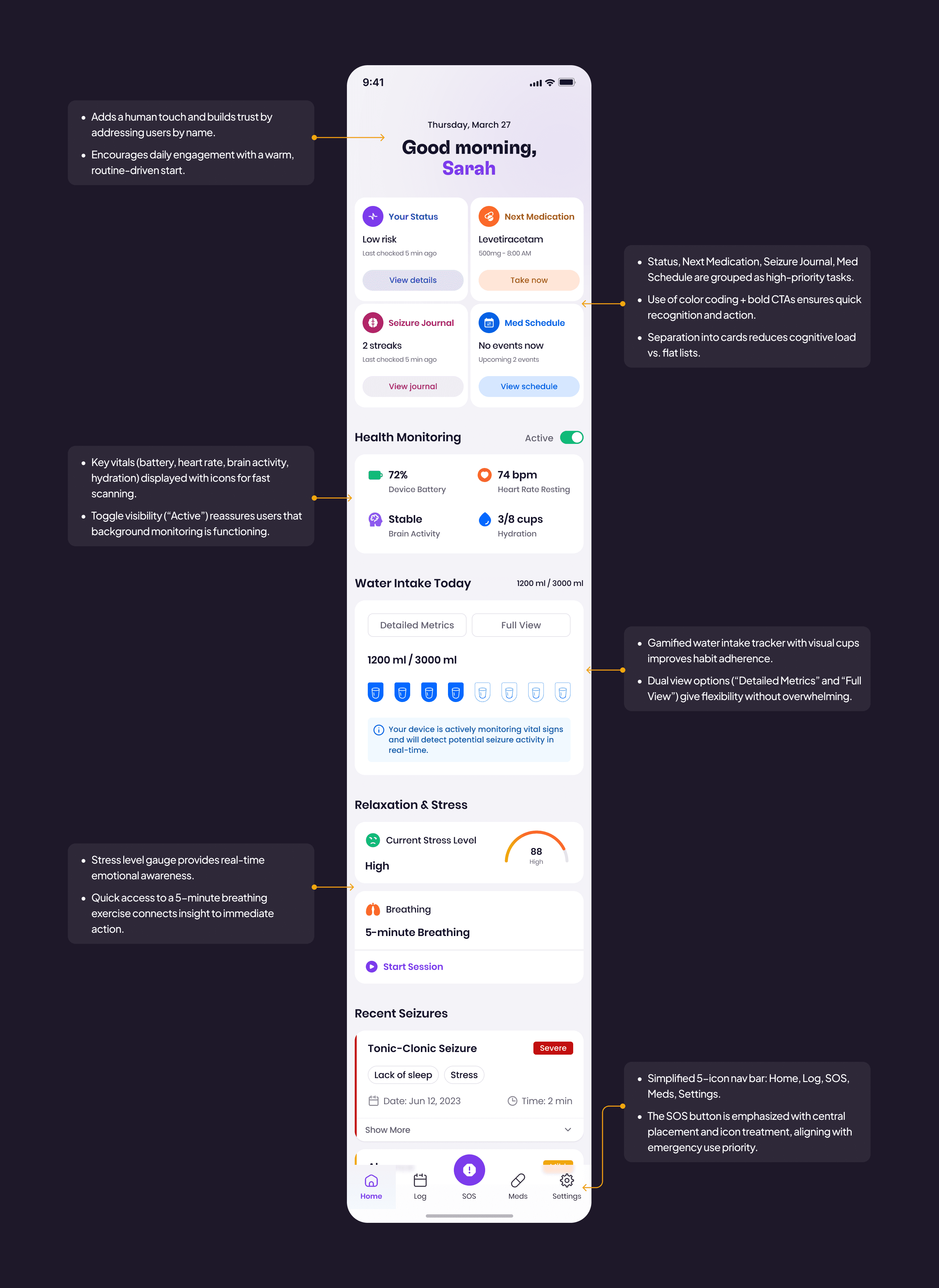
Home Screen Enhancements
The home experience centers on clarity and quick decision-making, surfacing only the most relevant actions and health context.
Priority dashboard with medication, seizure logs, and daily tasks upfront.
Clean presentation of vitals (battery, brain activity, hydration, heart rate).
Light-weight hydration and stress indicators to support daily routines.
More readable seizure summaries with severity and context at a glance.
Always-visible SOS entry for immediate access during emergencies.
Usability Test
Visualizing the quantifiable improvements from our redesign across key metrics
Usability Test
Visualizing the quantifiable improvements from our redesign across key metrics
Overall Improvements After Redesign
A concise overview highlighting key enhancements in usability, visual appeal, and performance achieved through the redesign.
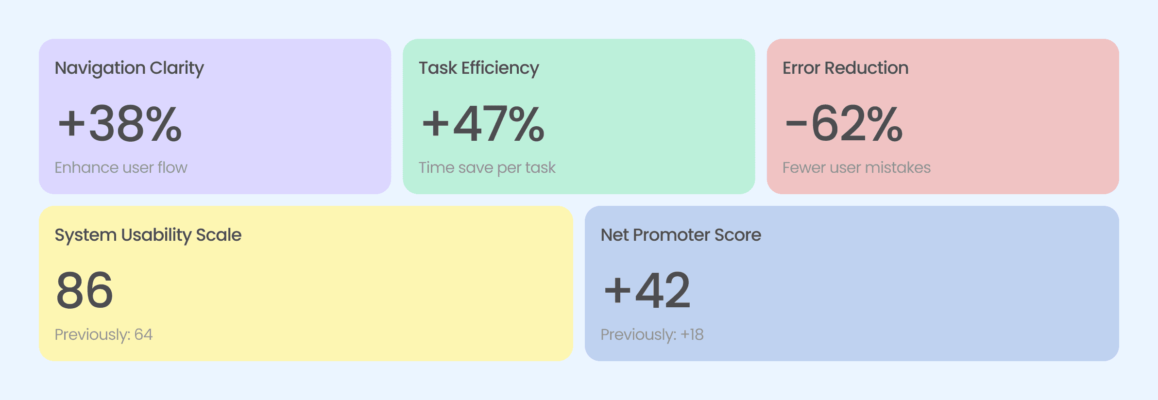
Overall Improvements After Redesign
A concise overview highlighting key enhancements in usability, visual appeal, and performance achieved through the redesign.