
Money OS
Money OS
Money OS
Mobile App
Mobile App
Mobile App
Overview
Overview
We redesigned Money OS to make everyday money tasks fast, clear, and safe. The new IA centers on five tabs Home, Pay, Budget, Grow, Profile with a unified Pay & Transfer flow, plain-language copy, and stronger guardrails (review, fees, arrival time, undo).
We redesigned Money OS to make everyday money tasks fast, clear, and safe. The new IA centers on five tabs Home, Pay, Budget, Grow, Profile with a unified Pay & Transfer flow, plain-language copy, and stronger guardrails (review, fees, arrival time, undo).
Accessibility and visual hierarchy were tightened to reduce cognitive load. Faster payments, higher onboarding and budget setup rates, fewer errors, and improved CSAT will be key measures of success.
Accessibility and visual hierarchy were tightened to reduce cognitive load. Faster payments, higher onboarding and budget setup rates, fewer errors, and improved CSAT will be key measures of success.
Tech Stack

Figma
Design Tool

React Native
User Interface Library

Xcode
IDE
Tech Stack
Figma
Design Tool
React Native
User Interface Library
Xcode
IDE
Tech Stack
Figma
Design Tool
React Native
User Interface Library
Xcode
IDE
ROLE
ROLE
UX Designer & Researcher
DURATION
DURATION
2 Month
PLATFORM
PLATFORM
Money Management App
Process
Process
Design Process
We led an iterative, empathy-driven process: user interviews and observations informed personas and journey maps, which guided low-fidelity wireframes and early prototypes. We refined flows through ongoing usability testing, focusing on clarity, safety, and task efficiency. Partnering closely with developers and clinicians ensured feasibility and clinical relevance. The result is an intuitive, reliable experience that effectively supports epilepsy management.
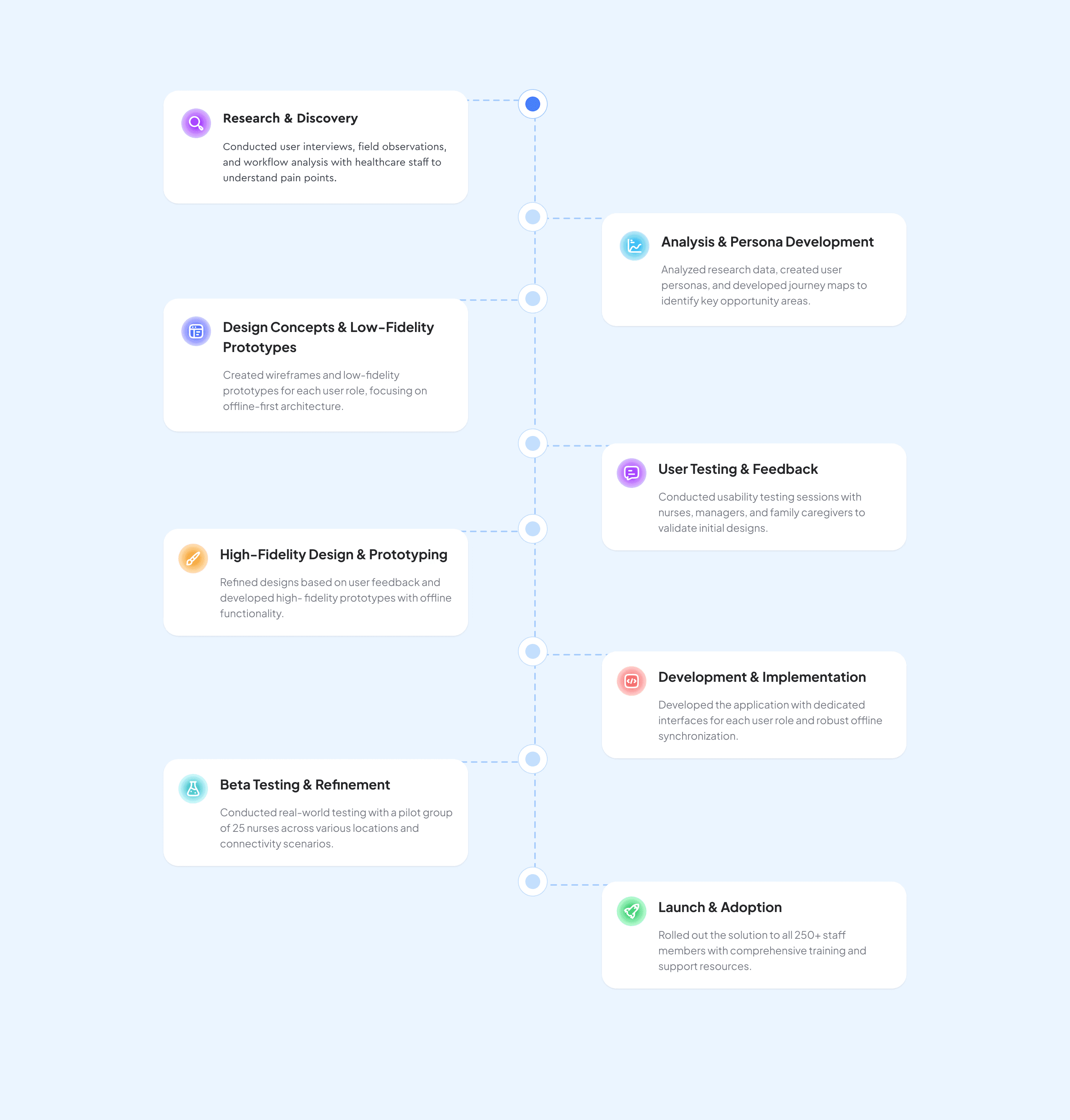
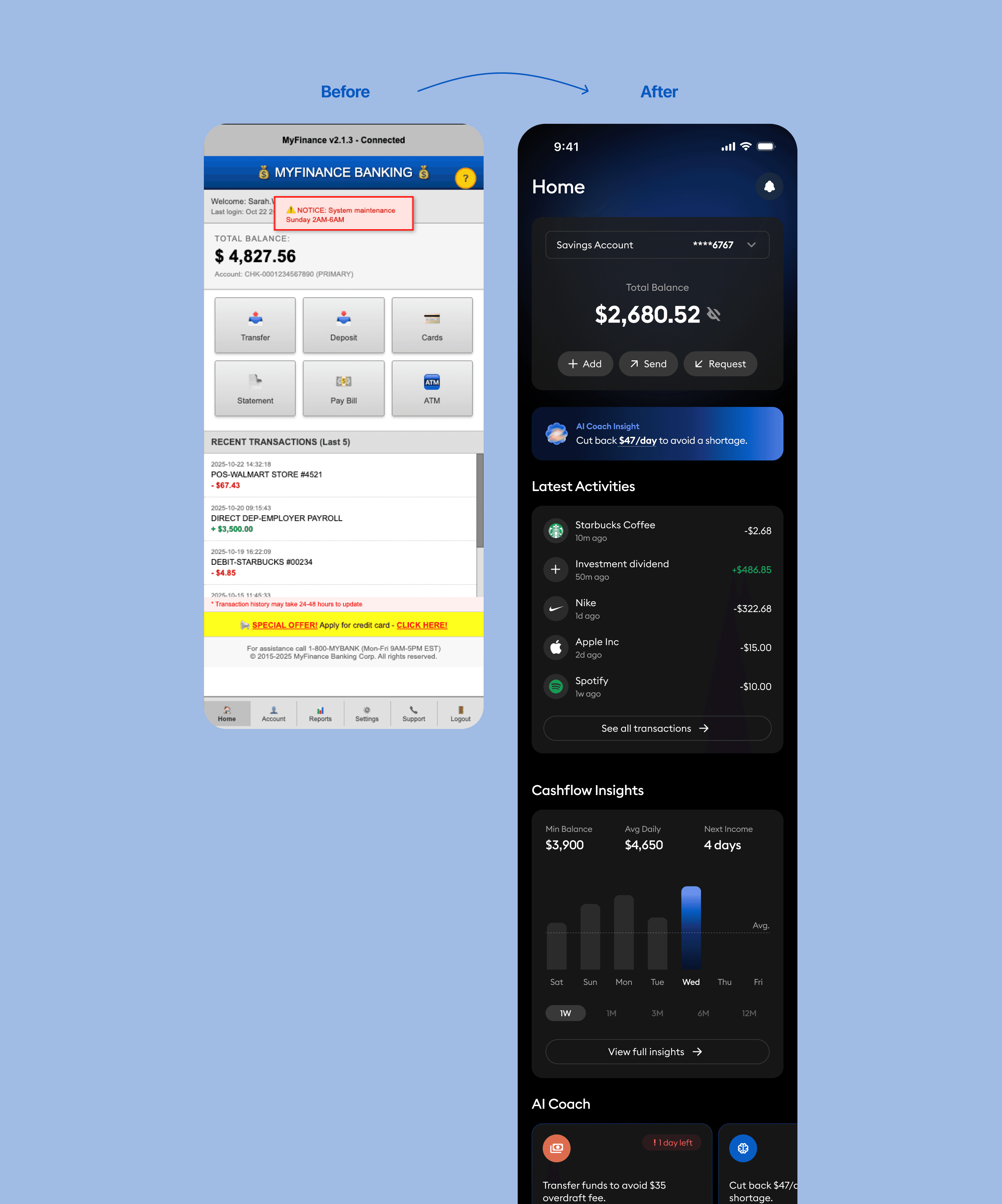
Before & After Comparison
The previous Home screen presented multiple financial widgets balances, transactions, insights, and goals without a defined hierarchy. Primary actions were buried within cards, and alerts competed for attention, making it difficult for users to identify what mattered most. As a result, users often hesitated on first load, backtracked between sections, and rarely leveraged insights to take action.
The redesigned Home introduces a focused, confidence-driven experience. A clear hero balance establishes context at a glance, with primary actions (“Add,” “Send,” “Request”) placed upfront. Insights and risk alerts are reframed as actionable guidance rather than noise, supported by visual hierarchy, contrast, and spacing that invite interaction. The result is a streamlined, modern interface that improves comprehension, trust, and usability.
Before
The interface lacked a clear hierarchy; users struggled to identify primary actions such as transfers or deposits.
System alerts and promotional banners cluttered the screen, distracting from essential banking tasks.
Visual inconsistency in color, typography, and iconography created a dated and untrustworthy appearance.
Key information like balance and transactions was buried among unrelated details, causing cognitive overload.
The layout provided no actionable insights—users viewed static data without meaningful context or guidance.
After
A defined hero section now surfaces the total balance and key actions (“Add,” “Send,” “Request”) for instant clarity and engagement.
Clean, structured layout and spacing establish a strong visual hierarchy, improving readability and reducing fatigue.
AI-powered insights transform raw data into actionable guidance, supporting smarter financial decisions.
Consistent color palette and typography enhance brand trust and modernize the overall look.
Streamlined navigation and contextual feedback reduce friction, allowing users to complete core actions quickly and confidently.
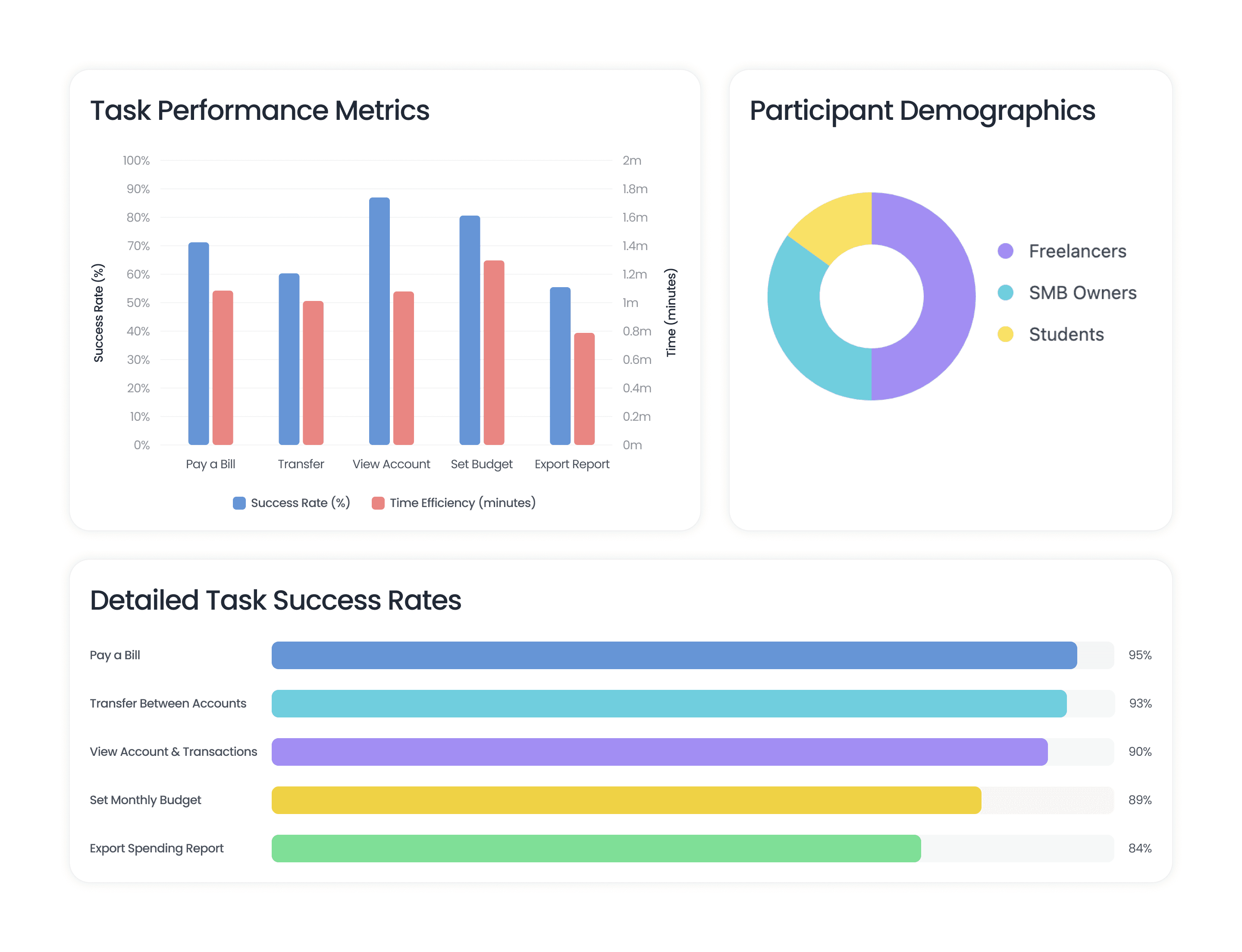
Quantitative Research
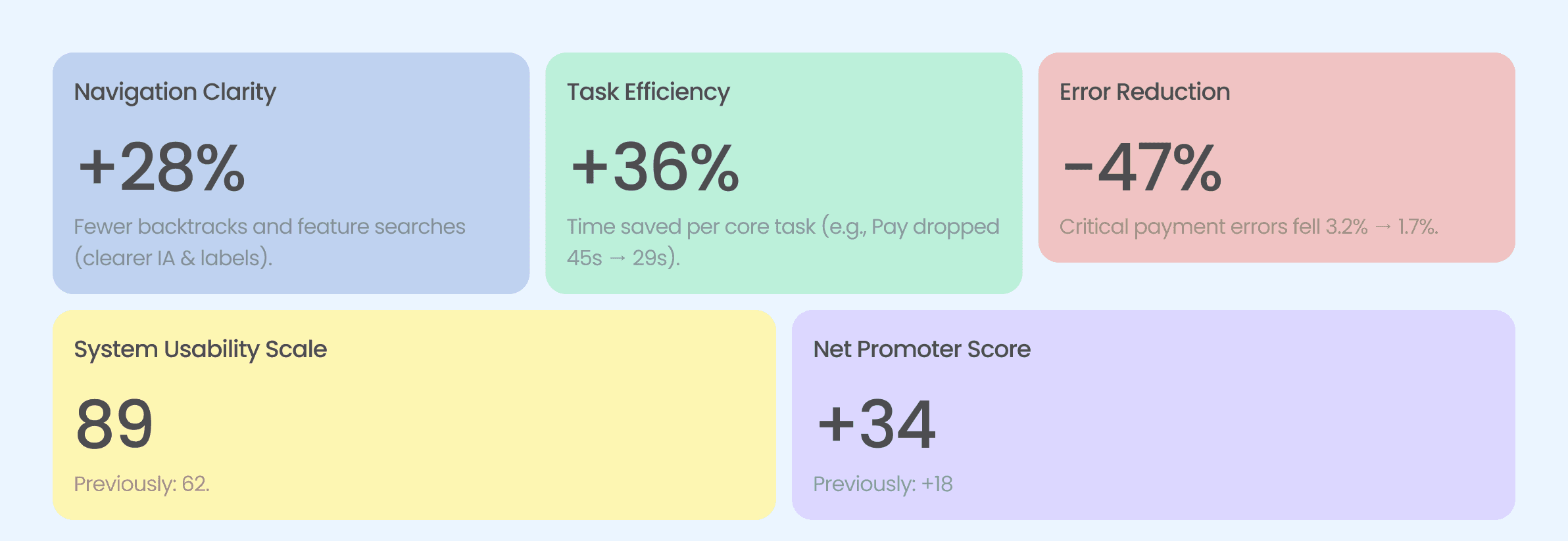
Usability testing showed strong gains with the redesigned Money OS mobile app. Task completion reached 90% (+22 pts), median time-to-pay dropped to 29 seconds, and the critical payment error rate fell to 1.7%, indicating faster, safer flows. Post-task CSAT averaged 4.3/5, and NPS rose to +34, reflecting higher user confidence and satisfaction.
Two minor, non-critical issues were observed intermittent bank-sync delays on poor networks and lower chart contrast in dark mode. Neither affected task completion, but they guide our next round of refinements.
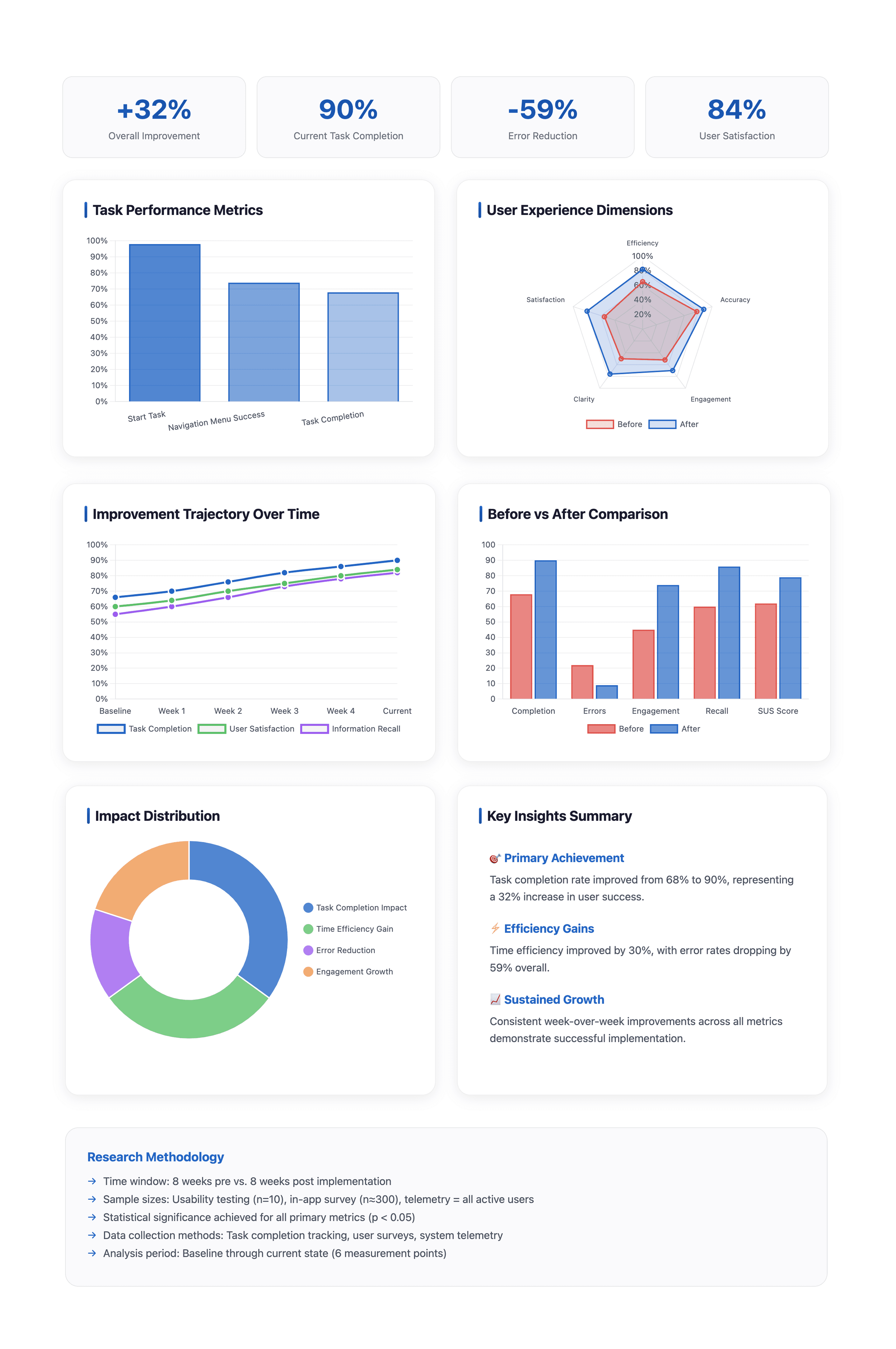
Quantitative Research
Usability testing showed strong gains with the redesigned Money OS mobile app. Task completion reached 90% (+22 pts), median time-to-pay dropped to 29 seconds, and the critical payment error rate fell to 1.7%, indicating faster, safer flows. Post-task CSAT averaged 4.3/5, and NPS rose to +34, reflecting higher user confidence and satisfaction.
Two minor, non-critical issues were observed intermittent bank-sync delays on poor networks and lower chart contrast in dark mode. Neither affected task completion, but they guide our next round of refinements.
User Persona
As part of our research, we created two user personas to capture the needs of our core audience. Informed by surveys and interviews, these personas highlight user goals, challenges, and motivations, ensuring the Money OS app redesign stays grounded in real experiences. They served as a foundation for feature prioritization and design decisions, directly addressing key scenarios in money management.
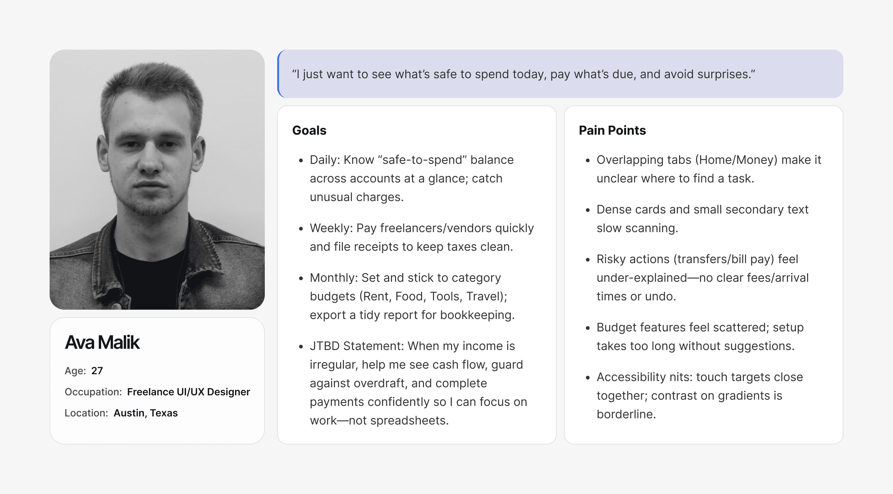
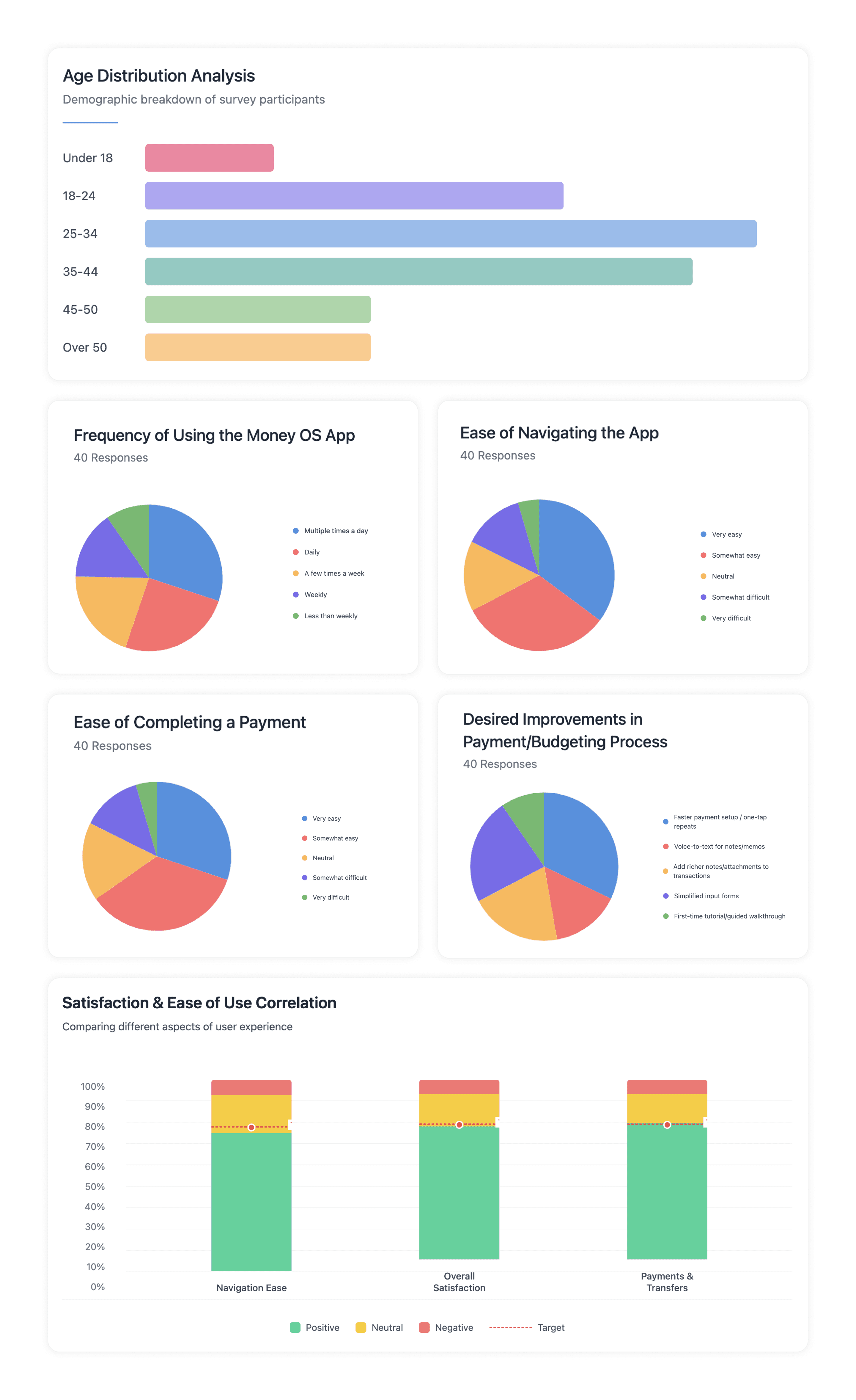
User Survey
We surveyed 200 users (largest cohorts: 25–34 at 29% and 35–44 at 25%). Overall sentiment was strong: 72% rated navigation positively, 74% reported high overall satisfaction, and 76% felt confident completing payments. Among 40 recent active users, most use Money OS daily or multiple times a day, and describe navigation and payment completion as very/somewhat easy. Top improvement requests focus on faster repeat payments, simplified input forms, richer notes/attachments, and voice-to-text, guiding our next iterations.
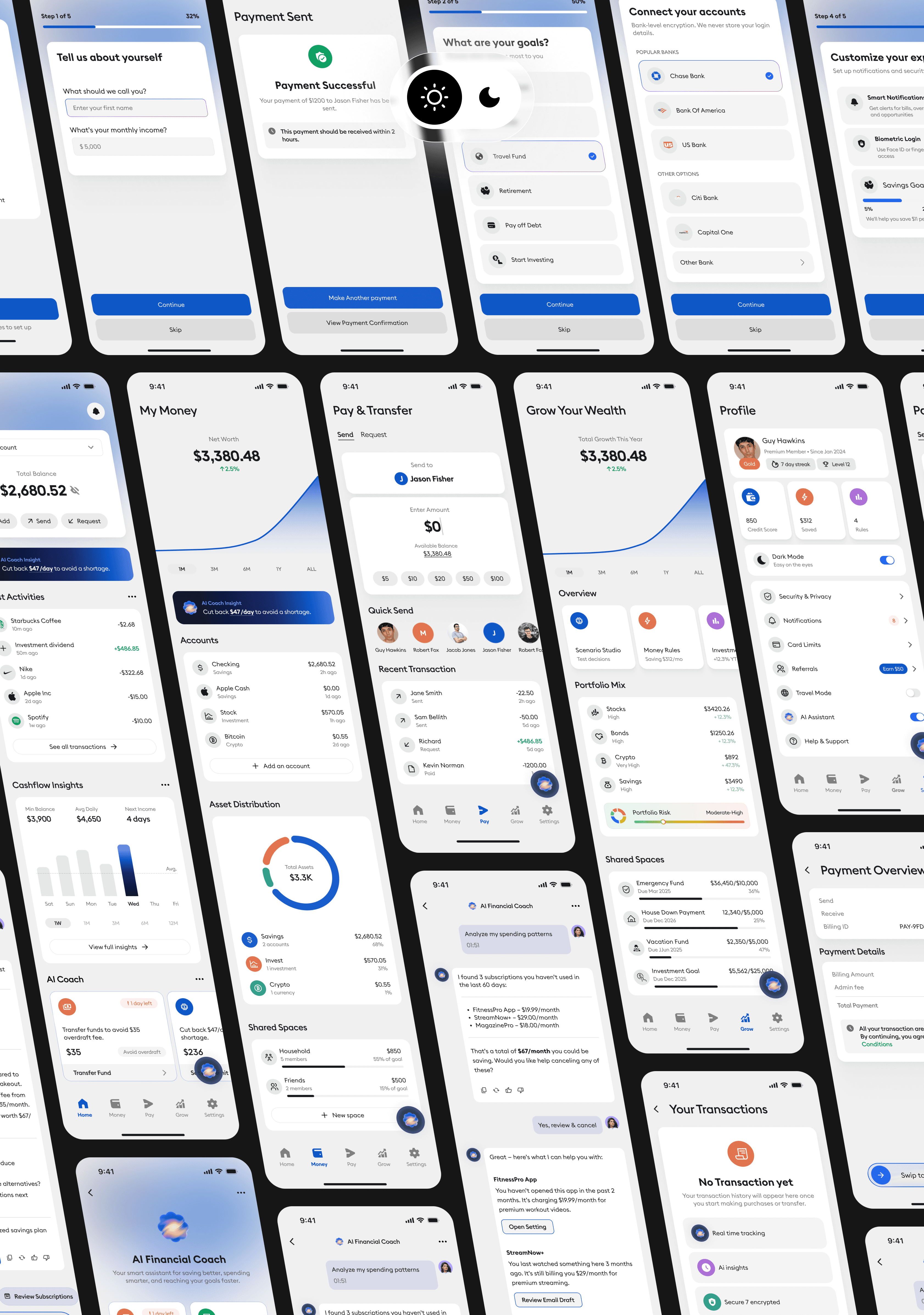
Wireframe
The wireframes present a cohesive set of screens for the Money OS app, designed to address everyday financial needs. From onboarding through goal selection, secure bank linking, and preference setup, each step is designed for clarity and accessibility. Core flows Pay & Transfer, Budgeting, Expense tracking, and Savings goals are organized for quick, confident action, with review screens, alerts, and simple charts to keep users informed. Together, these layouts streamline money management, increase trust, and keep essential informationbalances, bills, and progress right at the user’s fingertips.
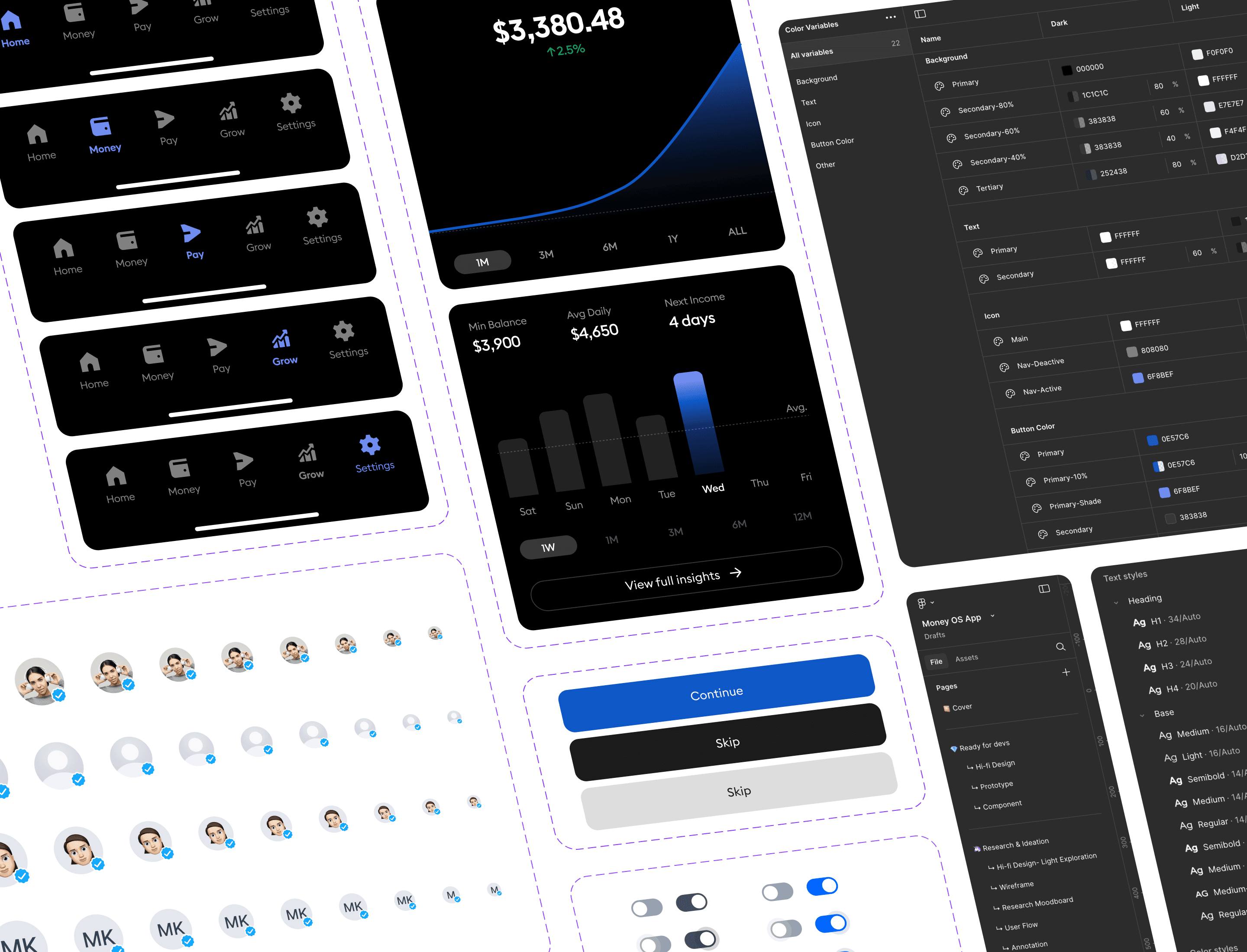
Design System
This design system establishes a unified visual and interaction language for the product, ensuring consistency across every screen. It defines color variables, typography, spacing, and component states for both light and dark modes. From buttons and toggles to charts and navigation bars, each element is carefully crafted to strike a balance between clarity, accessibility, and scalability—enabling teams to design faster and more cohesively while maintaining a polished, modern look.
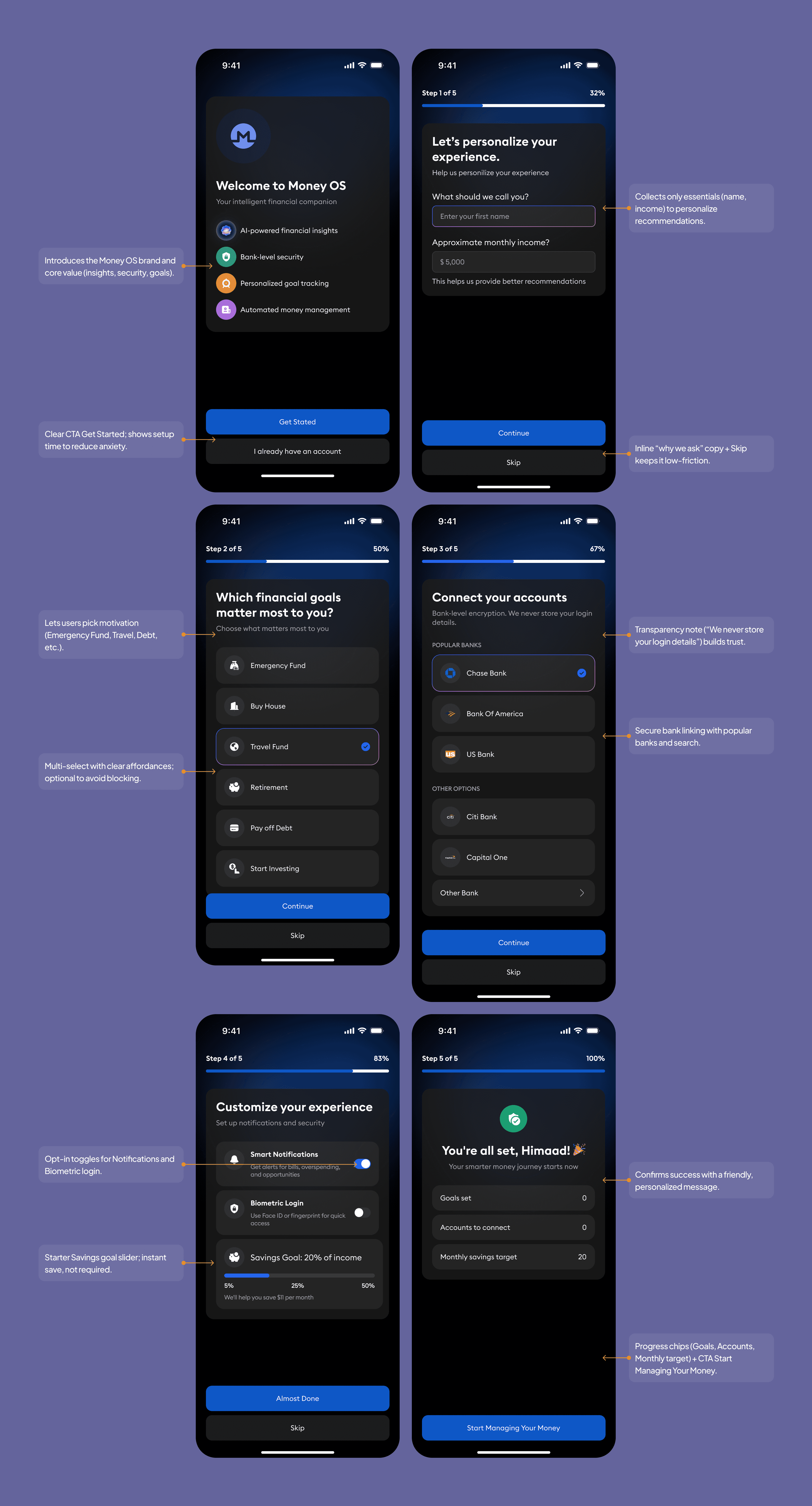
Simplifying Onboarding
This onboarding flow strikes a balance between simplicity, safety, and personalization, so users feel confident from the very first tap.
Welcoming Experience: Friendly welcome screen with a clear value proposition (“Smarter money, safely managed”) and a single Get Started CTA.
Step-by-Step Guidance: Six concise steps (basics, goals, bank link, preferences) with progress indicators to reduce cognitive load and keep momentum visible.
Personalization & Relevance: Collects only essentials (name, income, top goals) to tailor insights and recommendations without overasking.
Safety-First Design: Transparent, secure bank linking with plain-language consent; optional biometrics for quick, protected sign-in.
Data Transparency & Control: Explains what’s accessed and why; users can skip non-critical steps and adjust notifications/savings goals at any time.
Simple, Consistent UI: Clear forms, inline helper text, and consistent CTAs (“Continue,” “Skip”) guide users smoothly with accessible contrast and tap targets.
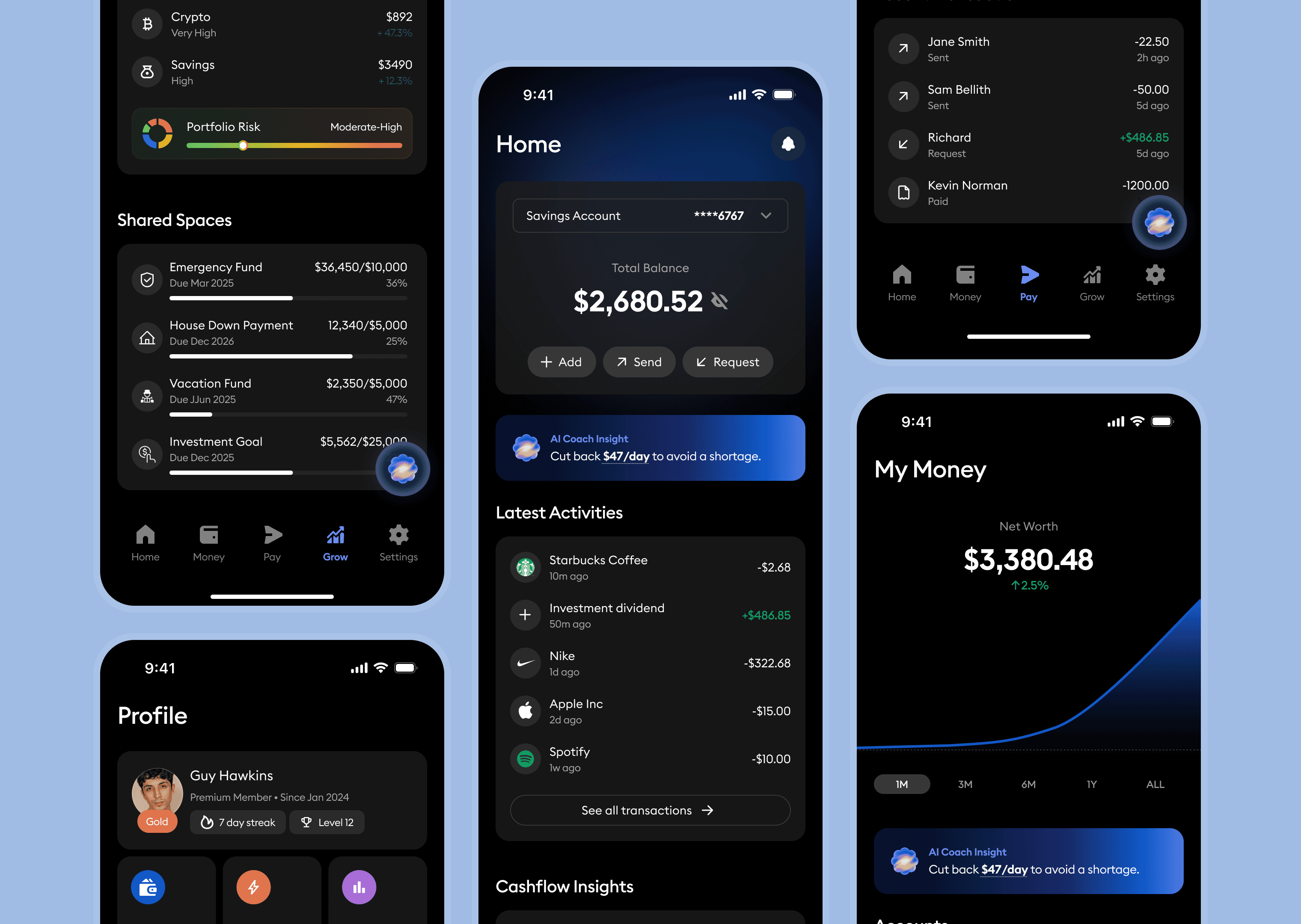
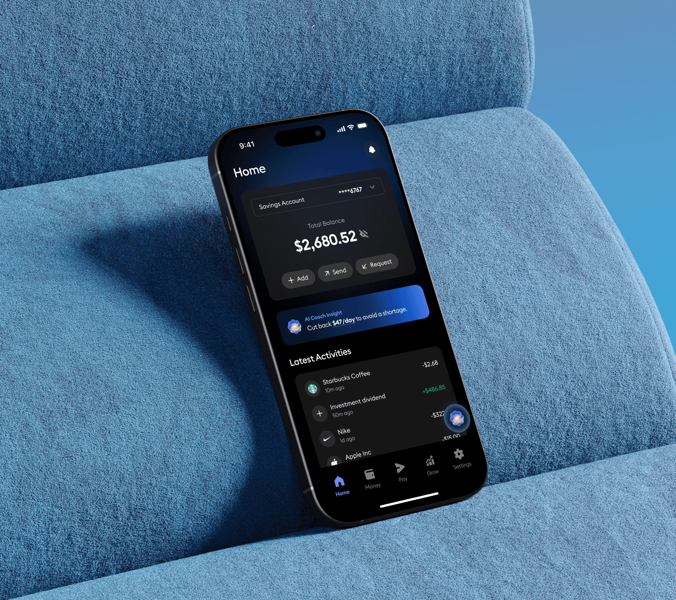
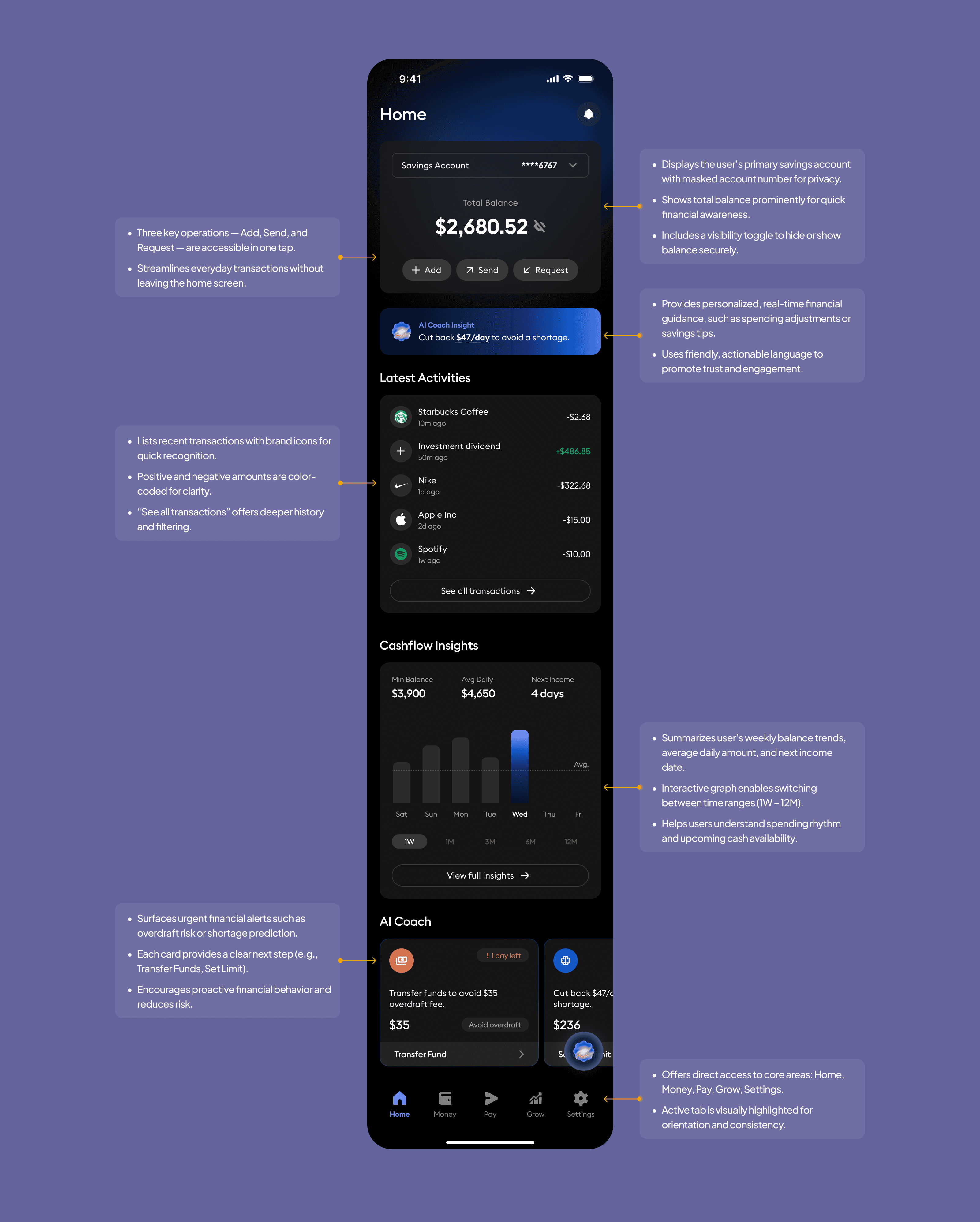
Home Screen Enhancements
The Home screen provides a quick and clear view of your finances. Your main balance is displayed at the top, with one-tap actions to Add, Send, or Request money.
Personalized insights from the AI Coach help you stay on track and avoid shortages. Recent transactions provide a clear view of spending, while Cashflow Insights highlight trends and upcoming income. At the bottom, smart AI alerts guide you with simple, timely actions to keep your money in control.
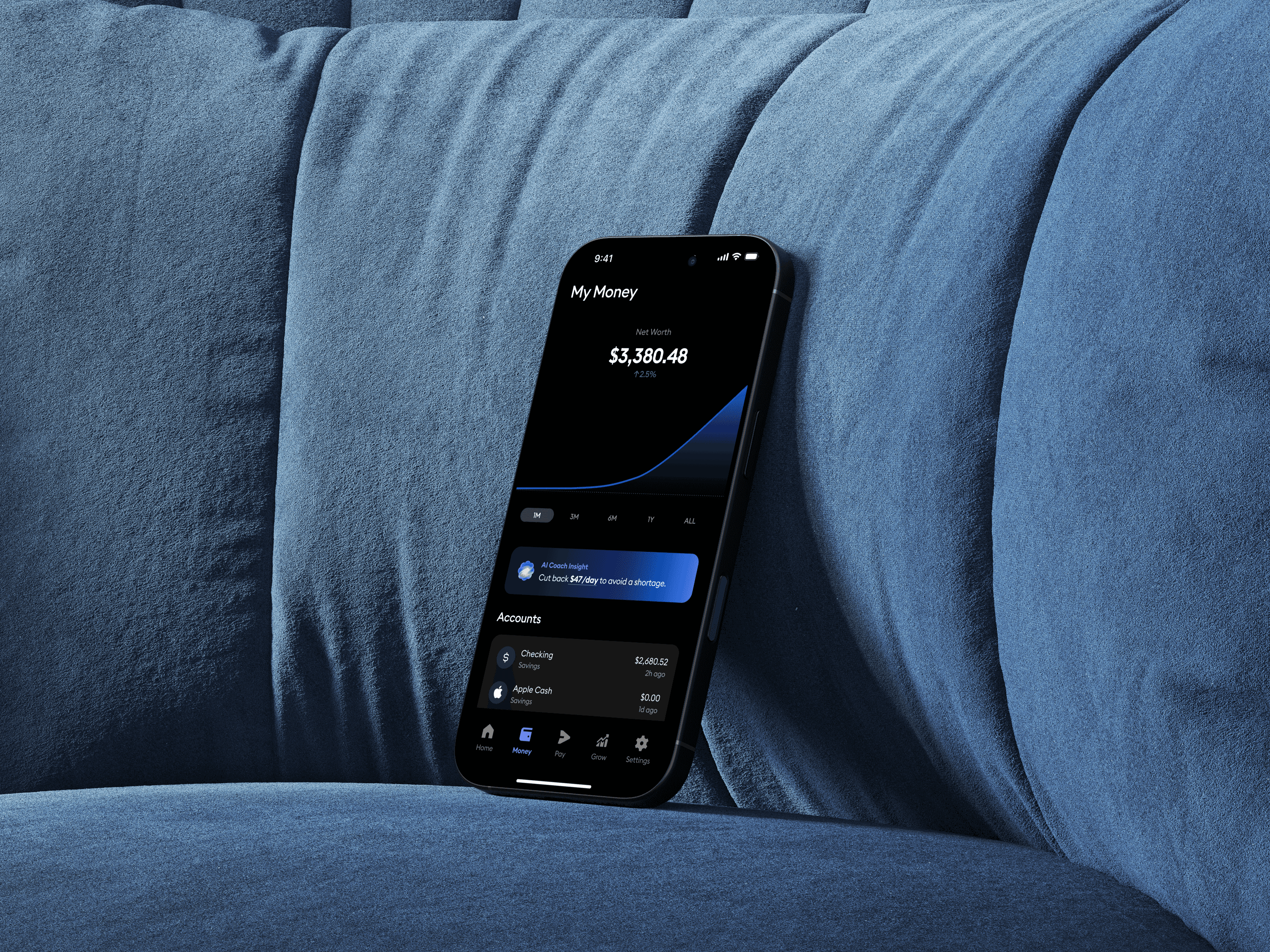
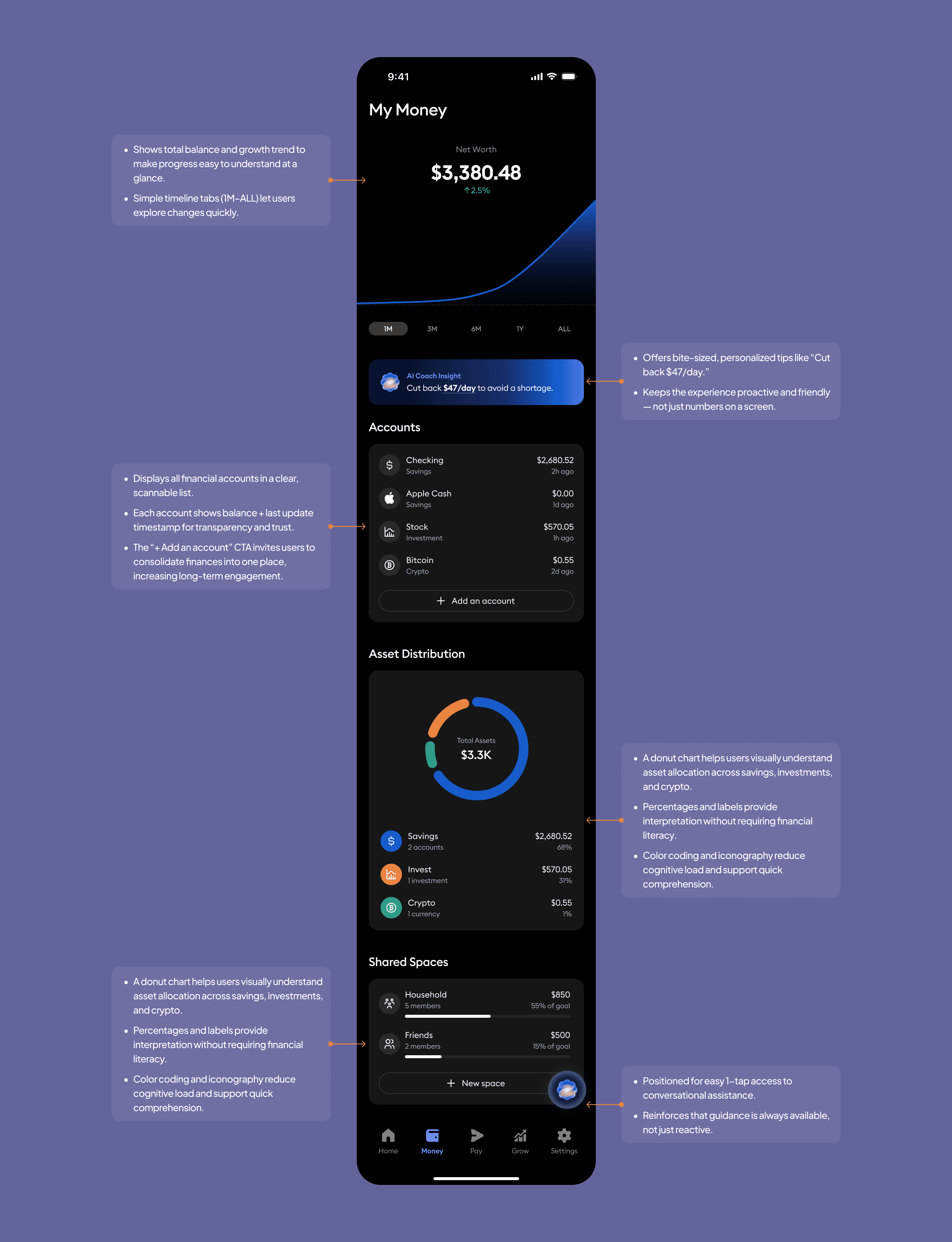
My Money Overview Screen
This screen provides a centralized, real-time snapshot of the user’s financial health—highlighting net worth trends, account balances, asset distribution, and shared financial spaces. It’s designed to provide users with clarity and confidence in understanding their current financial situation.
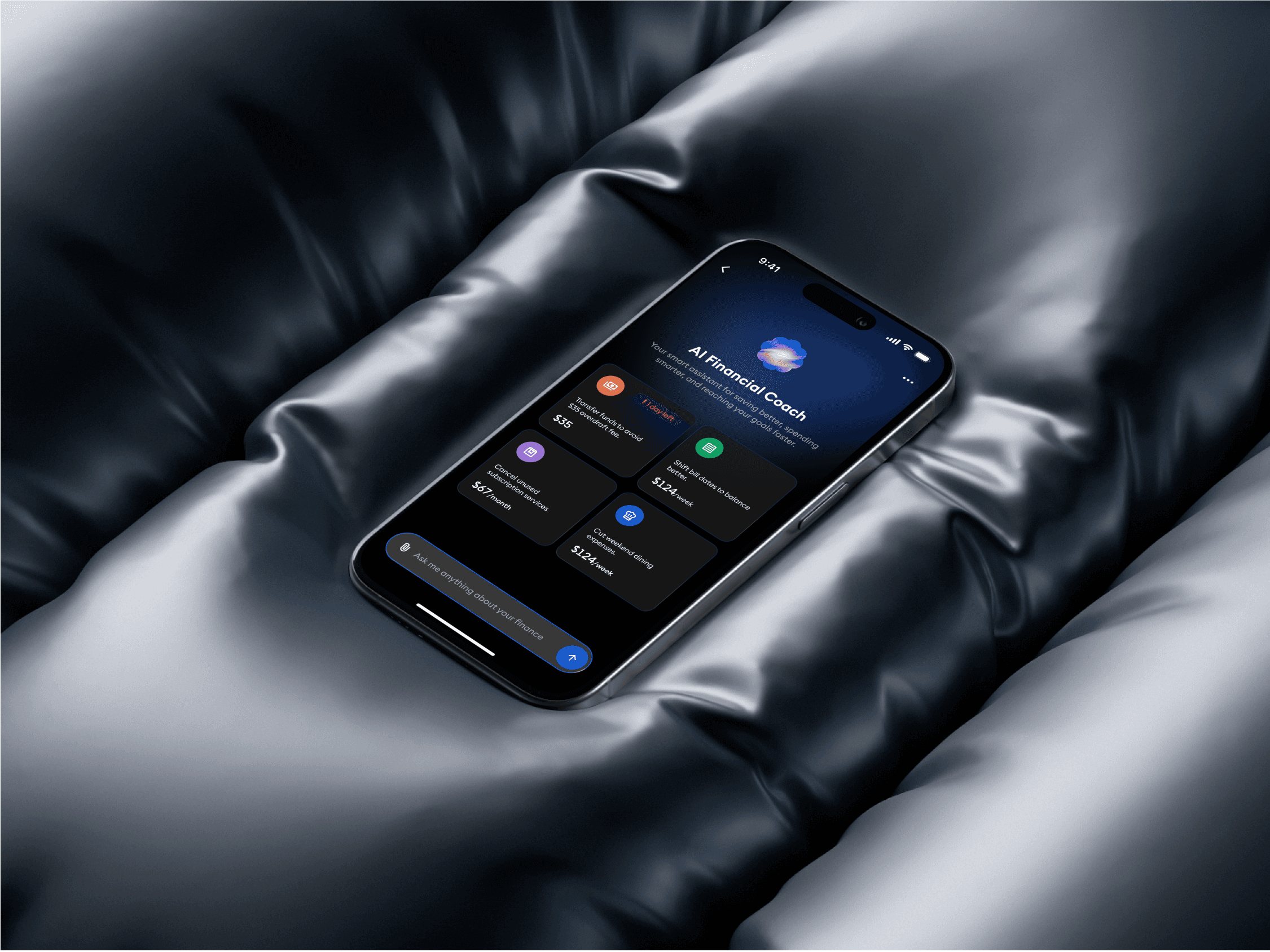
AI Financial Coach Screen
This screen introduces the AI Financial Coach, providing personalized, actionable insights to help users improve financial habits and reduce unnecessary spending.

AI Financial Coach Screen
This screen introduces the AI Financial Coach, providing personalized, actionable insights to help users improve financial habits and reduce unnecessary spending.
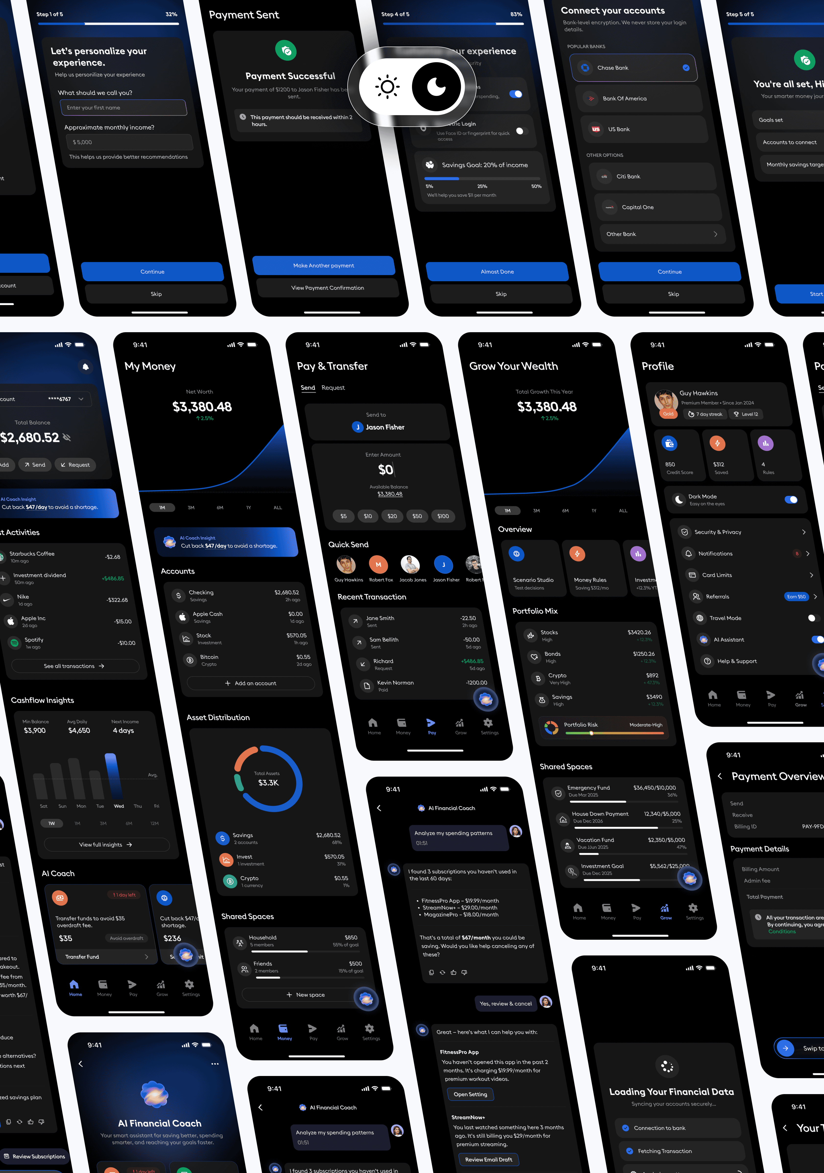
Prototype
The Money OS prototype brings the entire financial journey together from setting up your account to tracking spending, making payments, and getting smart insights from your AI coach. It’s designed to feel smooth and intuitive, with a clean, dark interface that makes every step simple and focused. The experience helps users stay in control of their finances while feeling guided, confident, and aligned with their goals.
Usability Test
Visualizing the quantifiable improvements from our redesign across key metrics
Usability Test
Visualizing the quantifiable improvements from our redesign across key metrics
Overall Improvements After Redesign
A concise overview highlighting key enhancements in usability, visual appeal, and performance achieved through the redesign.
Overall Improvements After Redesign
A concise overview highlighting key enhancements in usability, visual appeal, and performance achieved through the redesign.
Light Version
Light Version
Dark Version
Dark Version